Table of contents
At Droids On Roids, we develop digital products for clients around the globe, spanning industries from mobile commerce and foodtech to ecology. No matter the field, we see that accessibility is always crucial to an app’s market success and how it’s perceived by users.
Moreover, an increasing number of laws mandate app owners to comply with accessibility standards. Neglecting these can hit them hard in the wallet.
That’s why I want to share some tips with you on how to take care of accessibility in your next native Android app. This article is a second part of our series. In the first one, we discussed the reasons why accessibility is necessary, the touch targets, and colors.
In this blogpost, we’ll delve into topics like:
- Text size and scaling
- Focus order
- Labeling and content descriptions
Unlocking clarity – the impact of the smallest font size on accessibility
There is no defined smallest font size in the WCAG guidelines. But there are various third-party recommendations.
- Android Lint has the SmallSp check. It allows sizes down to 11sp.
- Adobe recommends at least 14sp with an absolute minimum of 12sp. Note the sp unit. It’s a scaled pixel. By default, it’s the same as a dp unit.
Yet users can always change the font size in the system settings:
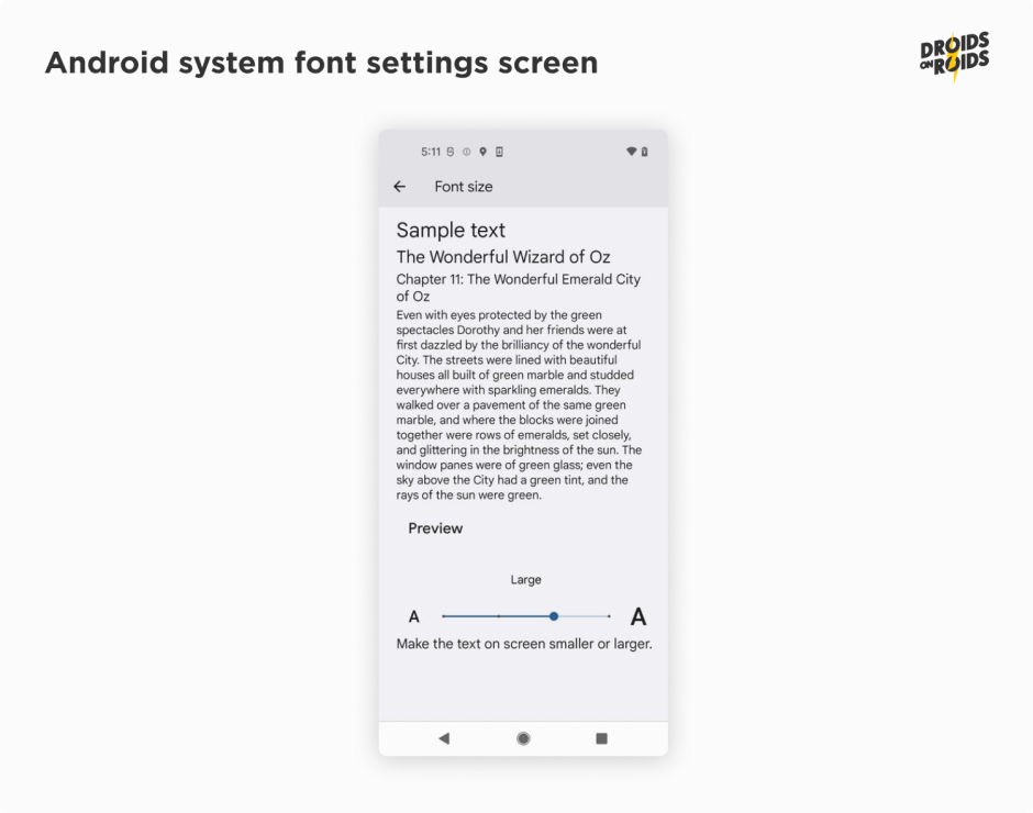
You can set a font size in the TextStyle:
TextStyle(
    fontSize = 14.sp,
)
Much more important than the font size, however, is the scaling. Users can change the font scale in the system settings. The app should respect it.
According to the WCAG Resize Text guidelines, users should be able to resize text by up to 200 percent. Of course, this should be achieved without any loss of content or functionality.
The Android system has supported non-linear font scaling to 200% since version 14. But some manufacturers have their own solutions. Samsung, for example, allows scaling to 200%, even when on older Android versions.
If you use the sp unit, the font size will scale automatically. However, you should also check how the layout looks with large font scales. You can use the @Preview annotation to check it in the Android Studio. For example, to simulate the 200% font scale, you can use the following code:
@Preview(fontScale = 2f)
What can go wrong when the font scale is large? The text can be too long. It can be cut off, wrapped or overlapped with other elements. There is no universal solution for all cases. Yet you can use the following tips:
The most accessible option is to always show the entire text, even if it’s occupying a larger space. In composables like Column or LazyColumn, you should add the verticalScroll modifier:
Column(modifier = Modifier.verticalScroll(rememberScrollState())
If the layout won’t look good, you can limit the number of text lines:
Text(
    text = "Lorem ipsum dolor sit amet.",
    maxLines = 2,
    overflow = TextOverflow.Ellipsis,
)
Look at the overflow parameter. It’s necessary to show the ellipsis when the text is cut off.
You can also choose the Visible value. It’ll show the text without ellipsis. However, it can overlap other elements. Even if there is an ellipsis on the screen, screen readers (like TalkBack) will read the entire text.
There are some texts that should be always completely visible, such as the addresses. Imagine the following examples:
- Quincy Happy Wall Street 52a 26133 New York
- Quincy Happy Washington Avenue 144 56892 New York
If they are cut off, the users won’t be able to distinguish them:
- Quincy Happy Wa…
- Quincy Happy Wa…
There is another important aspect when it comes to scrollability. You have to decide what elements should scroll and which should remain fixed. Usually, there are no issues with top bars like AppBar. They are pretty much always on top. Yet the bottom bars can be problematic. Look at the following screenshot:
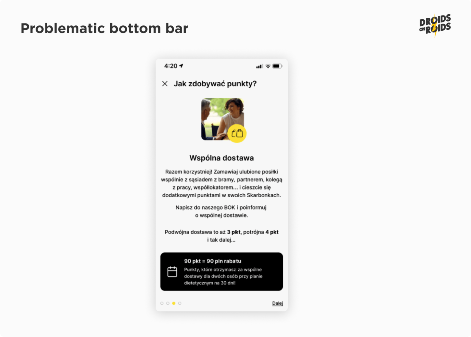
The bullets and the link button in the bottom bar seem to be important. So they should remain fixed at the bottom. But how exactly should this look? Should there be any padding, rounded corners or shadows?
The design shows only a “happy” scenario when everything fits on the screen. It seems that the designer hasn’t thought about the large font scale. This is a quite frequent case.
Now look at the corrected design:
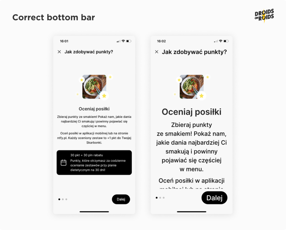
Keep in mind that the visible part of the screen can be low, even if the font scale is normal. On Android devices, we have the multi-window mode. The user may need to use another app at the same time. Here’s how it may look like:
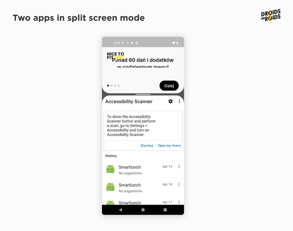
Look at the logo at the top-left side. It’s always on the top on purpose.
Read also:
- How Much Does it Cost to Develop an App? New Cost Breakdown
- 8 Key IoT Security Challenges and Proven Solutions from the Field
Let’s move on to another important topic in terms of mobile app accessibility: focus order.
Navigating with precision – mastering the focus order
The WCAG 2.1 guidelines say that all the functionality should be accessible from a keyboard. Nowadays, smartphones usually don’t have a physical keyboard, but they do have a virtual one.
You can also connect one via Bluetooth or USB OTG. The Talkback screen reader also acts as a keyboard. What’s more, the user can navigate with a D-Pad or stick on wired and wireless controllers.
To ensure that app is usable when the user navigates with such keystrokes, you have to check the focus order. Pressing the Tab or arrow keys should move the focus in a logical order. A focus can also move due to the IME (Input Method Editor) action on the on-screen keyboard.
The IME action button is usually in the bottom-right corner of the keyboard at the place of the Enter key.
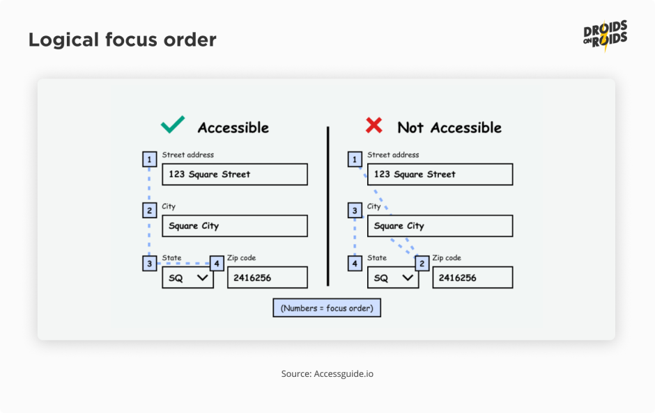
By default, the focus moves to the closest composable in the given direction (left, right, up or down). Jetpack Compose uses declarative API. It means that the order of the composable functions in the code is the same as the order of the composables in the UI.
So, in most cases it works out of the box, so you don’t have to do anything. There are some exceptions, however, like ConstraintLayout. So, sometimes you have to change the default focus order. For example, look at the following form with two columns:
Column {
    Row {
        TextField(
            keyboardOptions = KeyboardOptions(imeAction = ImeAction.Next),
            onValueChange = {},
            value = "First name",
        )
        TextField(
            keyboardOptions = KeyboardOptions(imeAction = ImeAction.Next),
            onValueChange = {},
            value = "Email",
        )
    }
    Row {
        TextField(
            keyboardOptions = KeyboardOptions(imeAction = ImeAction.Next),
            onValueChange = {},
            value = "Last name",
        )
    }
}
It gives a result like this when moving the focus forward:
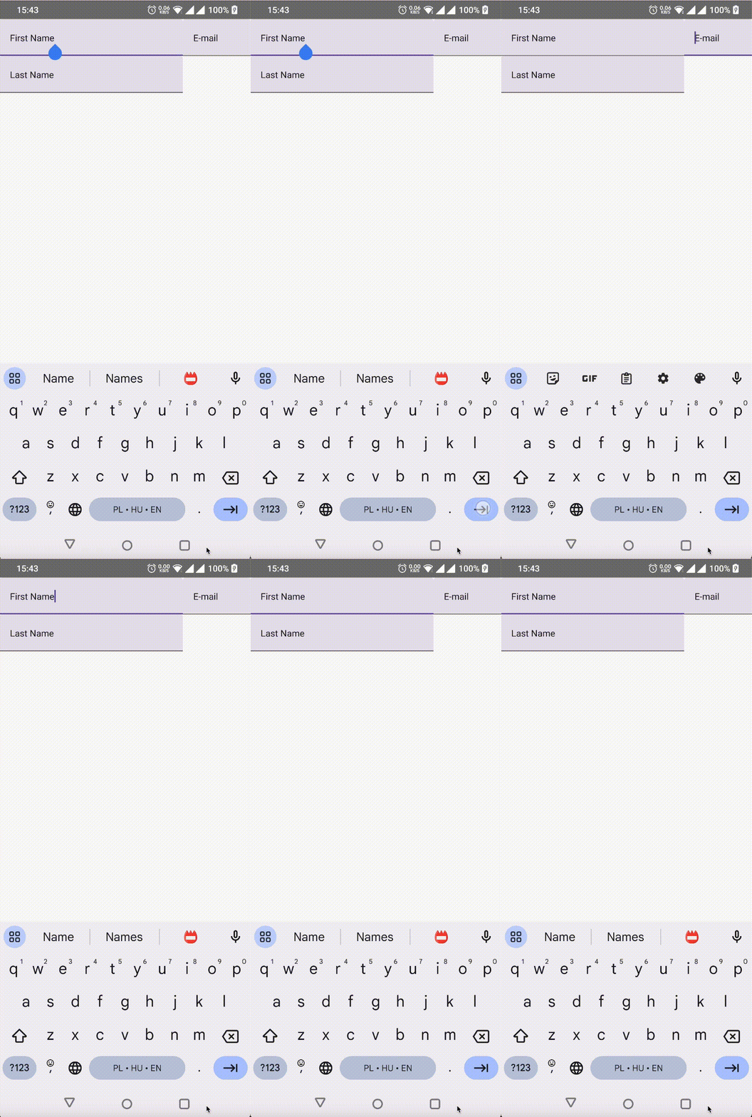
You’d rather expect the focus will move from the first name to the last name. Yet it moves to the email field instead. To fix that, add the focusRequester and focusProperties modifiers:
val (firstNameField, lastNameField, emailField) = remember { FocusRequester.createRefs() }
Column {
    Row {
        TextField(
            modifier = Modifier
                .focusRequester(firstNameField)
                .focusProperties { next = emailField },
            keyboardOptions = KeyboardOptions(imeAction = ImeAction.Next),
            onValueChange = {},
            value = "First Name",
        )
        TextField(
            modifier = Modifier
                .focusRequester(emailField)
                .focusProperties { next = lastNameField },
            keyboardOptions = KeyboardOptions(imeAction = ImeAction.Next),
            onValueChange = {},
            value = "E-mail",
        )
    }
    Row {
        TextField(
            modifier = Modifier
                .focusRequester(lastNameField)
                .focusProperties { next = firstNameField },
            keyboardOptions = KeyboardOptions(imeAction = ImeAction.Next),
            onValueChange = {},
            value = "Last Name",
        )
    }
}
Now the focus moves in the expected order:
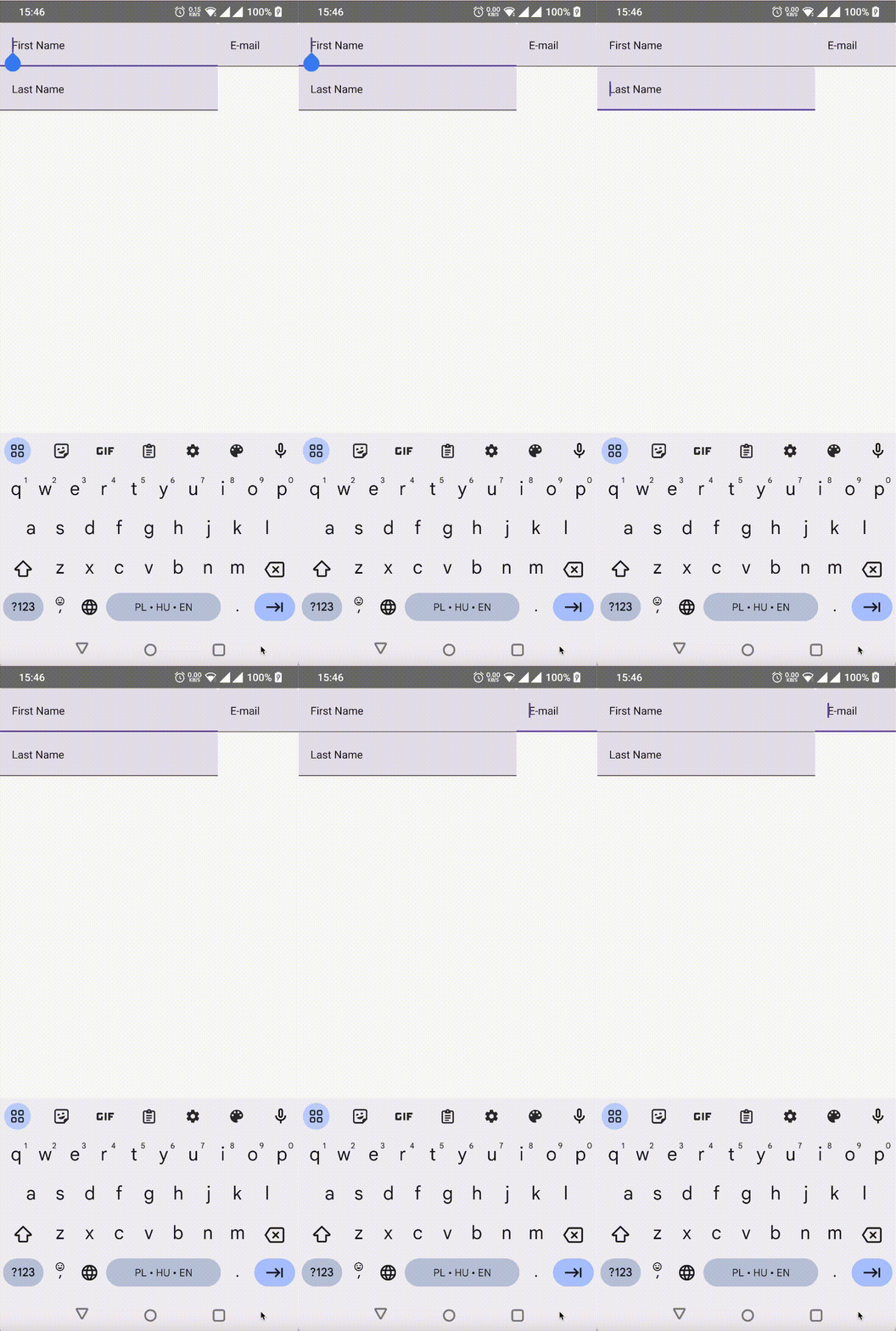
Another common case is to move the focus to the field with an error when the user tries to submit an invalid form. The same applies to moving to the first field when the user resets the form. To do that, use the FocusRequester#requestFocus() function:
Button(onClick = { focusRequester.requestFocus() }) {
    Text("Reset form")
}
In the previous code snippets and screenshots, you saw the IME action Next. It’s the most common action because in most of the cases, there is some next field.
However, there are other actions, like Done or Search. You can find the full list in the ImeAction documentation. It’s important to set the correct action and its callback. For example, it may look like this:
TextField(
    keyboardOptions = KeyboardOptions(imeAction = ImeAction.Send),
    keyboardActions = KeyboardActions(
        onSend = {
            // send the form to the server
        }
    ),
    onValueChange = {},
    value = "First name",
)
Adding the Next IME action won’t add reactions to Enter and Tab keystrokes. To do that, use the onPreviewKeyEvent:
modifier = Modifier.onPreviewKeyEvent {
    if (it.nativeKeyEvent.keyCode in arrayOf(
            KEYCODE_DPAD_CENTER, KEYCODE_ENTER, KEYCODE_NUMPAD_ENTER, KEYCODE_TAB
        ) && it.type == KeyEventType.KeyDown
    ) {
        focusManager.moveFocus(FocusDirection.Next)
        true
    } else {
        false
    }
}
Don’t forget to add the it.type == KeyEventType.KeyDown condition! If you won’t do that, the focus will move twice on each keystroke. Once when you press the key and next when you release it. You should also take a look at the return value. true means that you handled the event and prevented it from propagating further to other handlers.
Let’s delve into another vital element of mobile app accessibility: content labeling.
Illuminating the unseen – the power of content labeling
It’s the time for the aspect most often associated with accessibility. Now you’ll learn how to develop screens readable by screen readers. This is important for people with visual impairments. They use tools like TalkBack to read the content on the screen. Before you begin coding, you need to understand how TalkBack works and set it up for development. You also need to know basic gestures.
Using TalkBack to navigate is a different experience compared to using your eyes. Imagine that you are blind and can’t see the screen. You can’t see the buttons and checkboxes. So, it doesn’t make sense to click them before you know what they do. A single tap can’t work as a click in touch mode!
TalkBack relies on the concept of focus. This is the same as what you just used in the previous section. A single tap focuses the element. Then, TalkBack reads what it is and what it does. To perform an action like clicking a button or changing the checkbox state, you need to double tap. Swiping right with one finger moves a focus to the next element. Likewise, swiping left moves a focus backward. To scroll the screen, you need to swipe up or down with two fingers.
There are many more gestures. Some of them require two, three or even four fingers. Others may use double or triple taps. The standard Android navigation gestures are also available. For example, to navigate back you can swipe down and then left. You can find the full list in the TalkBack gestures documentation.
Remember that, after enabling TalkBack, the navigation will change. A single tap will focus the element, not click it. To click you need to double tap!
Note that, when you use an emulator, device farms or tools like Vysor, the mouse navigation won’t change. It will still work as usual. A single mouse click will click the element. So, it makes more sense to use TalkBack on the physical device with a touch screen.
In the case of an emulator, when you are using the mouse, you can test only some functionalities. For example, you can inspect the focus area. If you are enabling it for the first time, you may want to keep the settings screens in the recent apps list. It will allow you to go back to the settings and quickly disable TalkBack.
You can find TalkBack somewhere in the system accessibility settings. The exact path may vary depending on the device manufacturer and Android version. On Pixel devices with Android 13, it’s found via Settings ▸ Accessibility ▸ TalkBack. Most modern devices come with preinstalled accessibility services.
But if you cannot find it, you can go to the store and install it. On Play Store, you can find the Android Accessibility Suite. Some manufacturers may also have their own accessibility tools. For example, Samsung has its own separate TalkBack app.
Before you enable TalkBack, go to the Settings ▸ Advanced settings ▸ Developer settings. Then enable the Display speech output option. It will allow you to see what TalkBack says in the toast messages. It’s very useful for testing and debugging. After enabling TalkBack, you should see something like this:
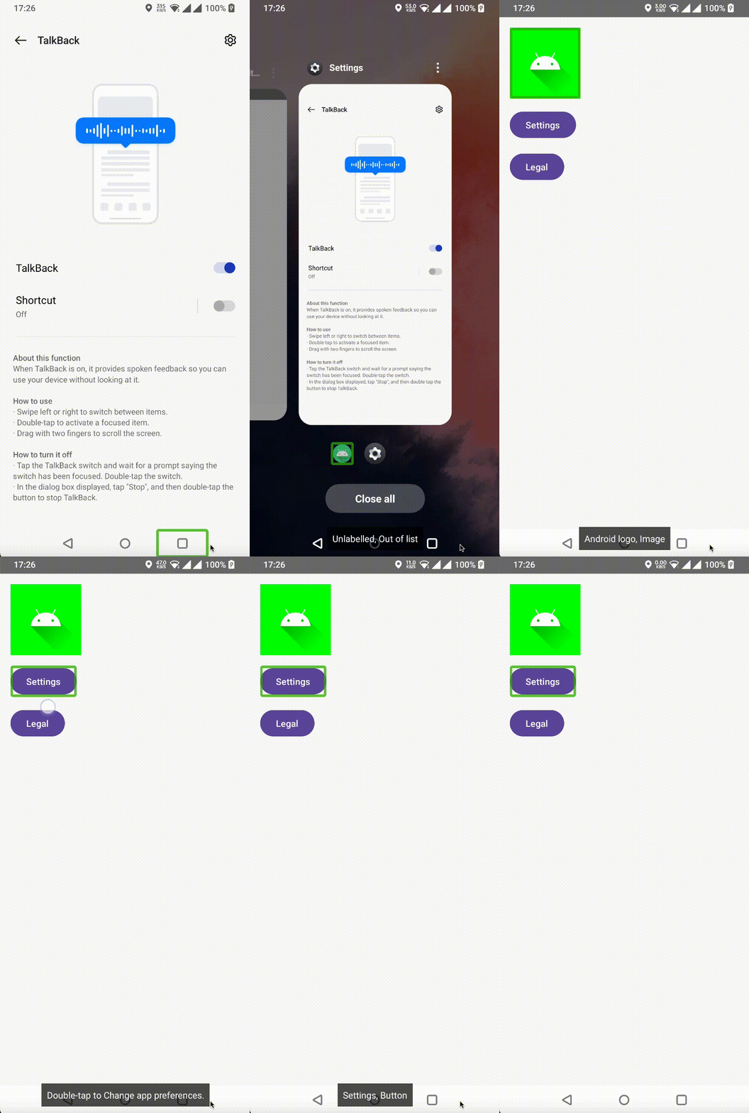
Note the blue frame. It’s the accessibility focus area. This is the area that TalkBack reads. It’s also the area that you can click with a double tap. The recording is from the Samsung Galaxy A71. On other devices, the stroke color may be different. For example, on Pixel devices it’s green.
Now you are ready to start coding. You’ll start with a simple composable. It’s a switch with a label. The entire area should be clickable and the effect should be like this:
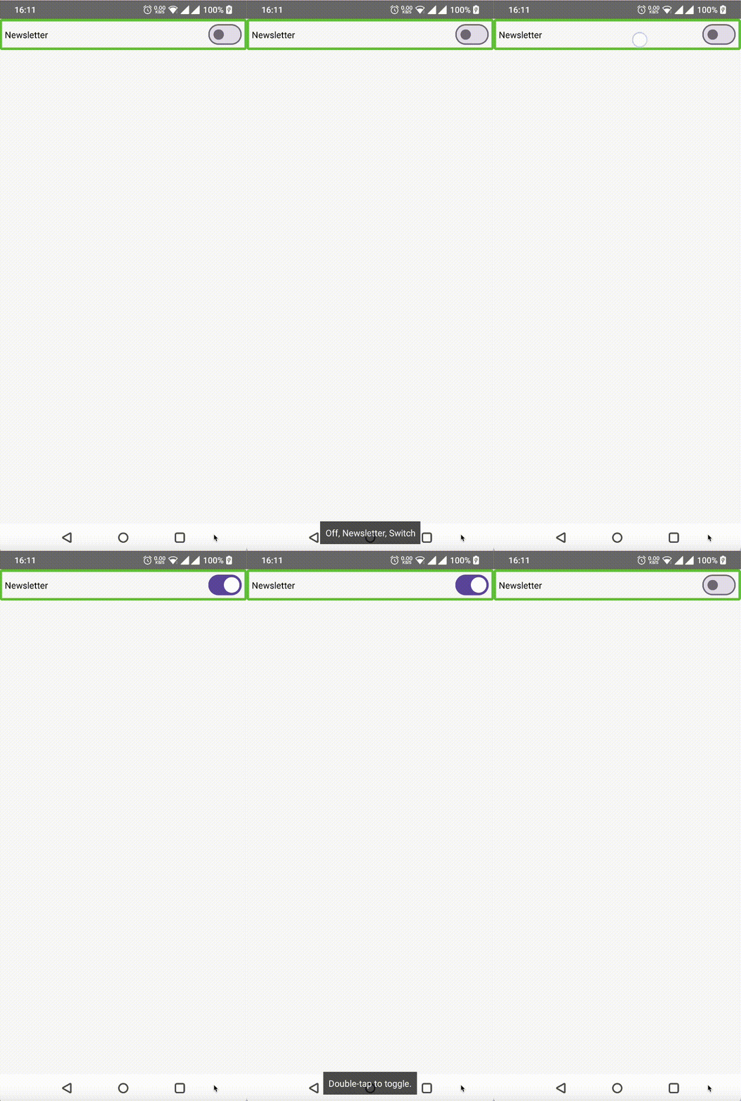
Here is the code:
var isNewsletterEnabled by remember {
    mutableStateOf(false)
}
Row(
    modifier = Modifier
        .toggleable(
            value = isNewsletterEnabled,
            onValueChange = { isChecked -> isNewsletterEnabled = isChecked },
            role = Role.Switch,
        )
        .padding(8.dp),
    verticalAlignment = Alignment.CenterVertically,
) {
    Text(
        modifier = Modifier.weight(1f),
        text = "Newsletter",
    )
    Switch(checked = isNewsletterEnabled, onCheckedChange = null)
}
There are several important parts.
Firstly, the entire row is interactive. More than just the switch itself, this includes the label and a padding around it. That’s why you set the value change callback on the row and not on the switch. If you want to customize the interaction, for example by adjusting a ripple effect, you should also do it on the row.
Secondly, you have the toggleable modifier. Not the clickable like you may find in the random tutorials on the internet! A toggleable supports two states: checked, unchecked and has the appropriate semantics. Note that TalkBack says double tap to toggle and recognizes the On and Off states. If you use a clickable modifier, it will say double tap to activate and will not recognize the current state. This is not so useful for people with visual impairments who don’t see the switch state.
Thirdly, there is the role = Role.Switch parameter. It’s a hint for TalkBack. It tells us that the row is a switch.
Finally, the onCheckedChange callback on a Switch is set to null. This is neither an empty callback { } nor the listener that performs some action like onValueChange above. It’s because the entire row is already interactive and has a switch role. A non-null callback on the Switch would make it interactive too. TalkBack will see two switches, which may be confusing for users who can’t see the screen.
Now, look at the full anatomy of the text read by TalkBack:
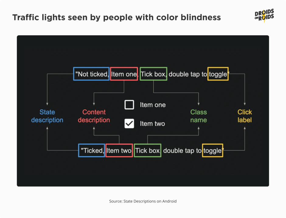
In the image above you see several parts. In most cases, you don’t have to configure them all yourself. The Compose framework will do that for you, based on the type of composables and modifiers you use. But you may sometimes want to customize some texts. For example, you may want to change On and Off labels to Enabled and Disabled.
How can you set those properties? In most situations, you can do it through the semantics modifier. For example:
.semantics {
    stateDescription = if (isNewsletterEnabled) "Enabled" else "Disabled"
    onClick(label = "toggle newsletter subscription", action = null)
},
A stateDescription, as the name suggests, describes the state. Apart from the varieties of On/Off, the state can hold more complex values. For example, the current progress of the progress bar or the position of the slider. But, in such cases, you should rather use a progressBarRangeInfo property with specific ProgressBarRangeInfo. You can also specify the minimum, maximum and step values there.
The contentDescription is a text that describes the main content of the composable. If there is a Text inside, it becomes the content description by default. So, you don’t have to set it manually. But, if a composable consists of a picture only, you have to set the contentDescription. Composables like Image have the required contentDescription parameter.
In fact, Image adds the semantics modifier with the value of that parameter. Although the Compose API enforces you to pass some contentDescription, it is not required for all images. If an image is used only for decoration purposes, you should pass null. The same applies to images already described by the nearby text. How do you know if the image is decorative or already described? Look at the following screenshot:
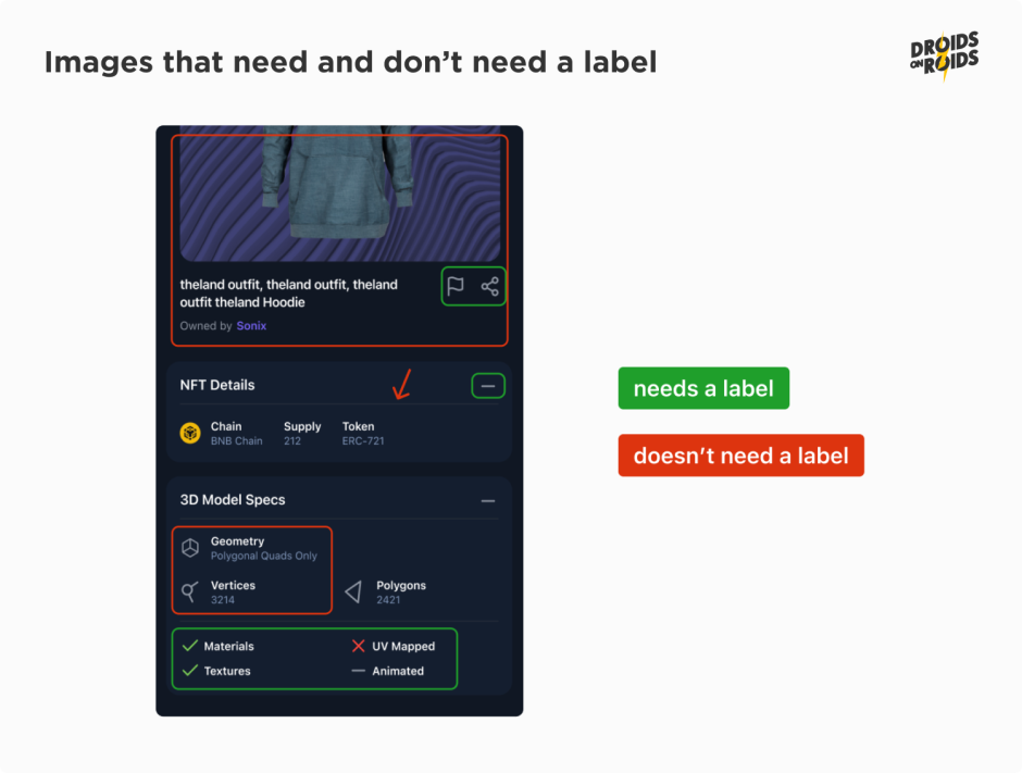
Images which need and don’t need a label.
All the pictures marked red don’t need a label. The big photo on the top has a description below. The divider pointed by an arrow is a decorative element. The icons in the 3D Model Specs section are only the illustrations to the texts on their right.
Everything marked green should have a label. The flag, share, and minus icons are part of buttons. You may ask why the ticks, cross and minus icon at the bottom should have the labels. There are texts near each of them.
So, they have natural descriptions, don’t they? Nothing can be further from the truth.
The texts near the icons are not the descriptions of the icons. They are the descriptions of the properties of the item. And icons tell whether a given property is present (tick), absent (cross) or we don’t know (minus).
When the image has a natural description they both should be treated as a single element in terms of accessibility. TalkBack should mark them as a single item. It should read the text and the image together. To achieve that, you have to add and set the mergeDescendants parameter to true in the semantics modifier:
.semantics(mergeDescendants = true)
This is the same case as with the Switch and Text in the previous example. But, there was no mergeDescendants in the snippets before. Is it a mistake?
No, it’s not!
The entire row has a clickable modifier. It merges descendants by default. Therefore, you don’t have to set it manually. You can read more about semantics merging in the official documentation.
Next you have a class name. This is a leftover from the old Android View system. In Compose, you cannot set it directly. But, there is mapping from roles to View class names. Standard composables like Button, Image or Checkbox set the role for you. But, if you create your own composable based on generic elements like Row or Column, you may want to set the role. You can find the full list of roles in the Role class documentation.
Finally, there is a click label. It’s a text that describes the action that will be performed after the click. In the case of buttons with texts like “OK” or “Cancel” you don’t have to set it. But if the clickable item is complex or its content comes from an external source like the backend, however, it may be useful to set it. Look at the following example:
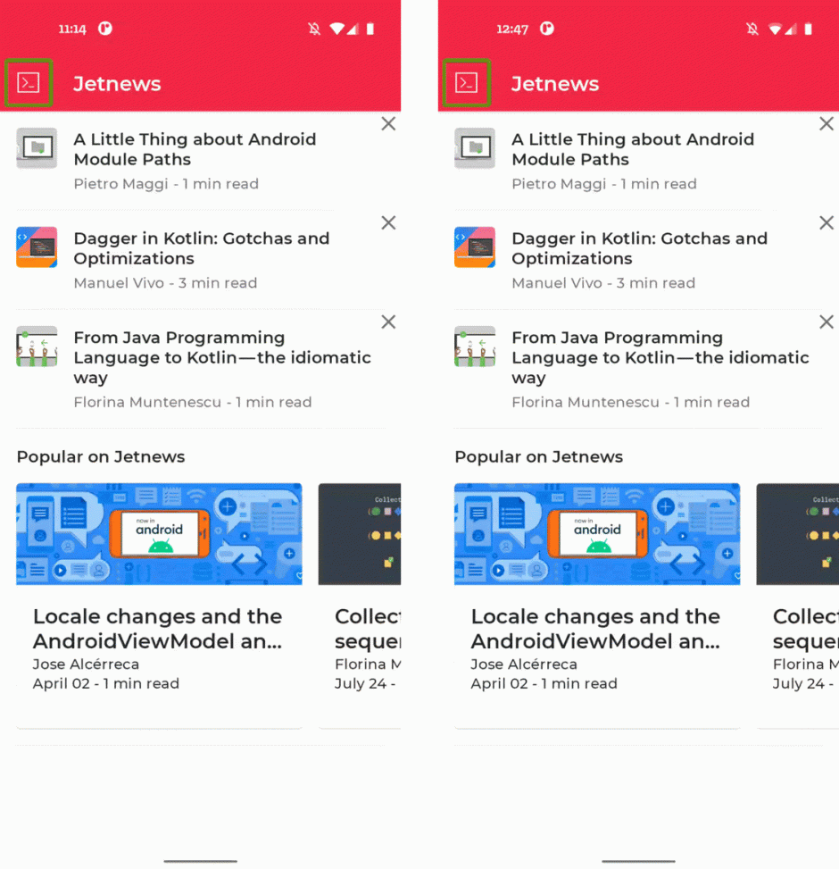
Typically, you’ll set it through the onClickLabel parameter of the clickable modifier. If you already have a modifier handling clicks, you can use an onClick semantic property.
Of course, the labels should be localized. You should use stringResource in the real apps.
Also, don’t stick to the order of the elements from the image. TalkBack may read them in a different order. It depends on the language and the user preferences in advanced TalkBack settings. It’s important to not mix the parts. For example, don’t put the state details in contentDescription. This is for the same reason you should not include the “Button” word in any of the textual properties. A role already provides that information.
There are semantic properties which provide extra information. For example, heading(). You should set it on the texts containing titles of the sections. TalkBack will announce them as headings. Users can choose to navigate between headings.
You can also consider gestures like “Pinch to zoom” or “Swipe to delete”. Now imagine the users who can’t perform swipe gestures. How can they access such actions?
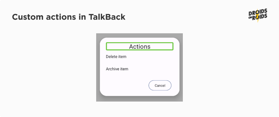
Here come the customActions semantics.
When you add a modifier like this:
.semantics {
    customActions = listOf(
        CustomAccessibilityAction(label = "Delete item", action = ::deleteItem),
        CustomAccessibilityAction(label = "Archive item", action = ::archiveItem),
    )
}
TalkBack will announce the actions and the users will be able to perform them:
The last property I want to mention in this article is testTag.
It’s very useful for testing. You can set a tag on any composable and then look for it in the tests.
There are many more semantics properties. You can find them in the official documentation.
Mobile apps accessibility – summary
In this article, you’ve learned how to improve the labeling and make your app more accessible for TalkBack users. Now you know about the scaling and size of texts. You are also familiar with managing the focus and keyboard navigation.
Taking care of all these aspects plays a crucial role in ensuring the accessibility of your applications. At Droids On Roids, we understand its importance and see how pivotal it is for the success of an app.
In the next part on accessible mobile apps, you’ll read about the next portion of semantics, screen orientation, mouse navigation, and more.
Stay tuned, and let me know in the comments below if you have any questions!
