Table of contents
This is the third part of our series on providing accessibility in Android apps with Jetpack Compose. The previous parts:
- How to Provide Accessibility in Your Native Android App | Part 1
- How to Provide Accessibility in Your Native Android App | Part 2
In the second one, you learned about the font scale, focus order and a few semantic properties. In this part, you’ll continue exploring the latter topic.
At Droids On Roids, we create digital products for clients around the globe, spanning industries from fintech and mCommerce to ecology. No matter the field, we know that accessibility is always crucial to an app’s success and how it’s perceived by users. That’s why we’re covering this subject in a series of articles.
Mastering real-time content updates with live regions
Imagine a date picker with arrow buttons to switch the months:
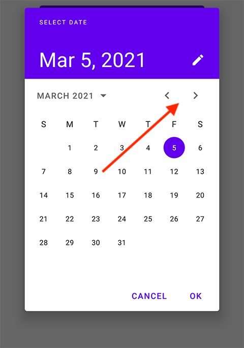
From the previous article, you know that the images need content descriptions. For example, we could use “Previous month” and “Next month”. You can customize the click action as well.
So far so good. However, there is little problem with those buttons. If you can see the screen, you can also spot the current month indicator next to the arrows. Users relying only on TalkBack don’t know what the month is. Of course they may move the focus to text with a month and/or count how many times they pushed each button, but this is hardly user-friendly.
It will be better to announce the new month on each change. You may think of changing the content description dynamically. This will work but there is a dedicated semantic property for such cases – the live region.
TalkBack will announce every text change of the live region. It doesn’t matter if it is currently focused or not. Let’s look at the code:
Text(
    text = dateFormatter.format(date), // 1
    modifier = Modifier.semantics {
        liveRegion = LiveRegionMode.Polite // 2
    },
)
In the snippet above, you have:
- A month and year announced by Talbkack whenever they change.
- A live region with mode.
Here is the effect:
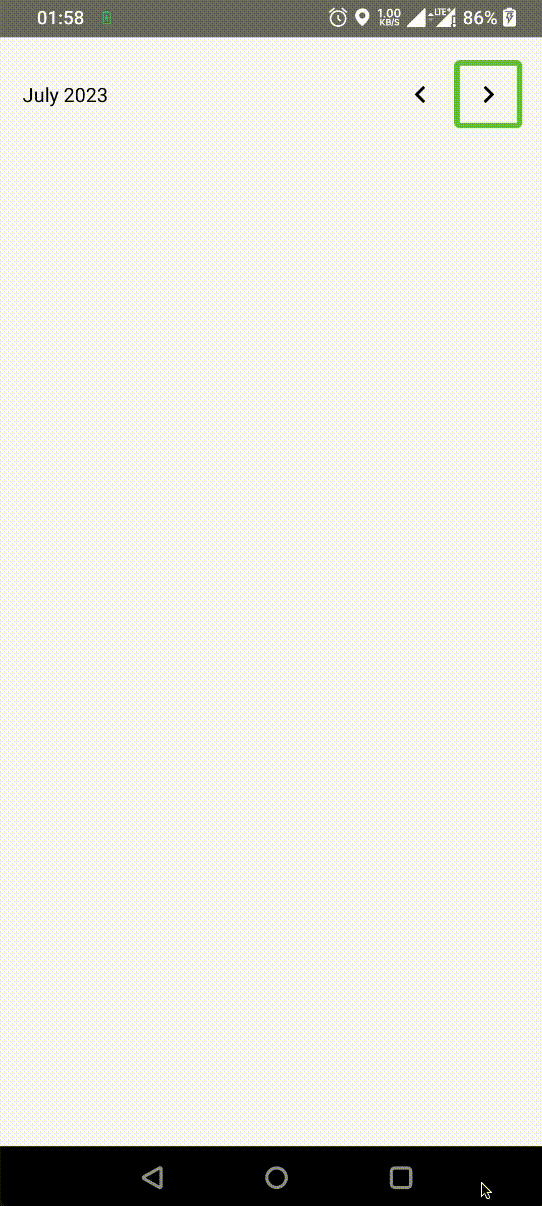
Note that TalkBack is announcing the month despite the fact that only buttons are being touched. The focus is never on the month text.
There are 2 modes:
Polite– this allows current TalkBack speech to be completed before announcing the live region.Assertive– this interrupts any current TalkBack utterances.
In the vast majority of cases, you should use the polite mode. Assertive is only suitable for very urgent and important information, such as alarms or input validations performed on the fly.
You can use a live region on the containers holding many text composables. TalkBack will concatenate texts of all the children. If you set the contentDescription property, TalkBack will speak it instead of text.
Navigational anchors: Harnessing the power of headings
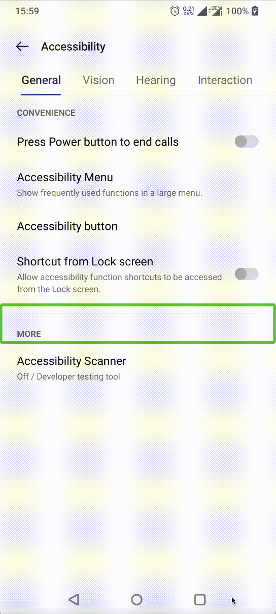
The heading is a title (header) of the section. It describes the content below. I briefly mentioned the headings in the previous part of this blogpost series. Now, let’s deep dive into this topic. Look at the following screenshot:
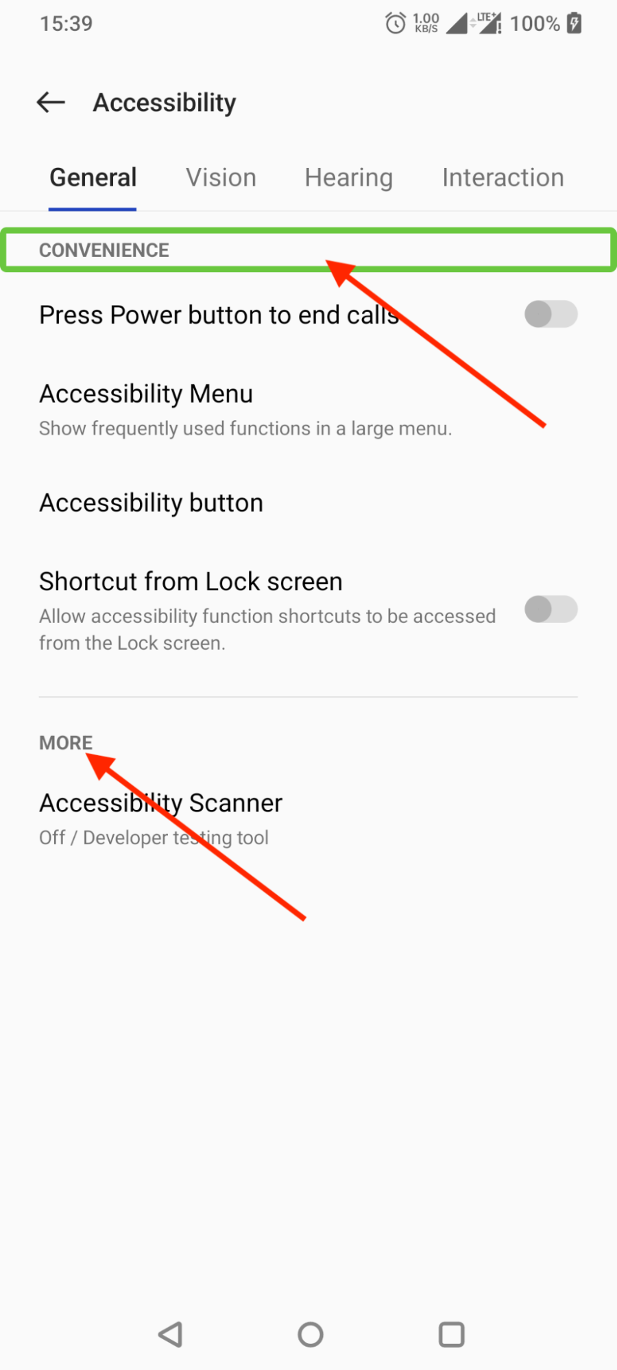
The “CONVENIENCE” and “MORE” texts are headings there. TalkBack users can choose to navigate between headings rather than between individual elements. To do that, first swipe with three fingers left or right until you hear “Headings”. Then you can swipe left and right to navigate to the previous and next headings, respectively. Watch the screencast below:
WCAG has several guidelines related to headings. In the case of websites, there are six header ranks from h1 to h6. In Android apps, we have only one, without any levels.
Jetpack Compose provides a heading() semantic property. It marks the composable as a heading for accessibility:
Text(
    style = MaterialTheme.typography.headlineMedium,
    text = title,
    modifier = Modifier
        .semantics {
            heading()
        }
)
The headings often correspond to the headline text styles. Choose the number of headings wisely. Too many of them may clutter the navigation. Too less, on the other hand, can make it difficult for users to find the desired part of your app. There usually has to be at least one heading on each screen. You should use them on the screen and section titles.
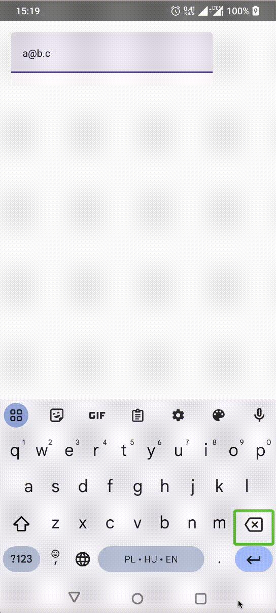
Enhancing accessibility through error semantics
Let’s consider a simple form with an error message, such as in the screenshot below:
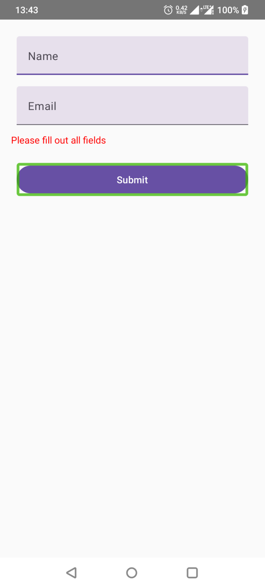
At a glance, everything looks fine. The error message is red, so it is obvious for everyone that it’s an error. Well, blind users cannot see the colors. TalkBack reads only the content of the text. It doesn’t say what the color is.
You need to add semantics to the error message. To do that, use the error() semantic property. Look at the code below:
Text(
    text = "Please fill out all fields",
    color = Color.Red,
    modifier = Modifier
        .padding(top = 4.dp)
        .semantics {
            error("Name and email must not be empty")
        }
)
Now TalkBack announces an error correctly:
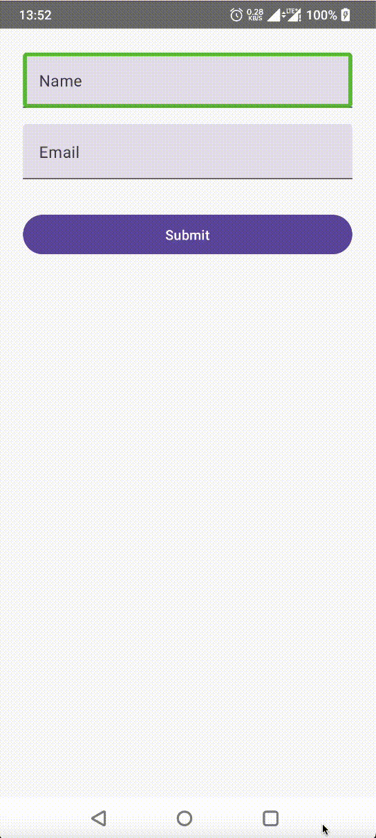
In the case of the TextFields there is a built-in isError parameter. It adds the error semantics under the hood. For example, see the following snippet:
TextField(
    value = "koral",
    onValueChange = {},
    isError = true,
    supportingText = { Text("Login already taken") },
)
It should give a result like this:
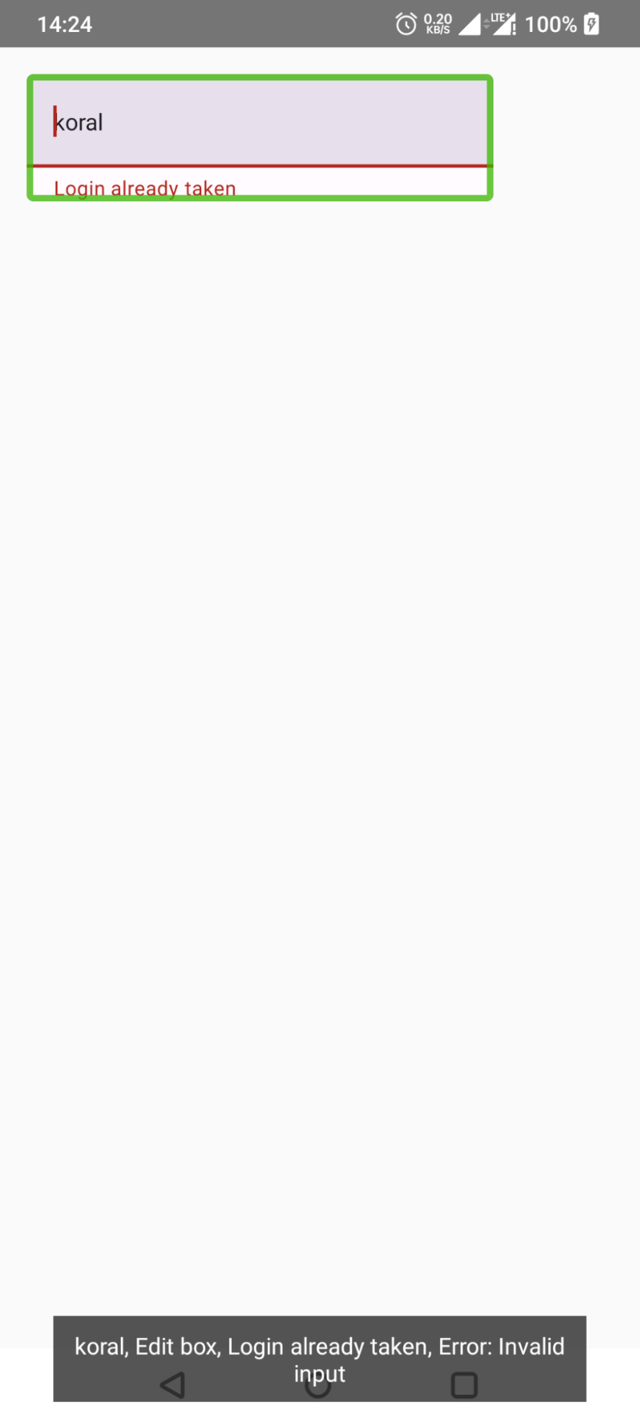
Note the default “Invalid input” error message. To customize it, you have to use the lower-level composables and style the error on your own. For instance, you can use the BasicTextField:
BasicTextField(
    value = "koral",
    onValueChange = {},
    decorationBox = { innerTextField ->
        Column {
            innerTextField()
            Text(
                modifier = Modifier.semantics {
                    error("Could not use this login")
                },
                style = TextStyle(color = Color.Red),
                text = "Login already taken"
            )
        }
    },
)
It will give a result like this:
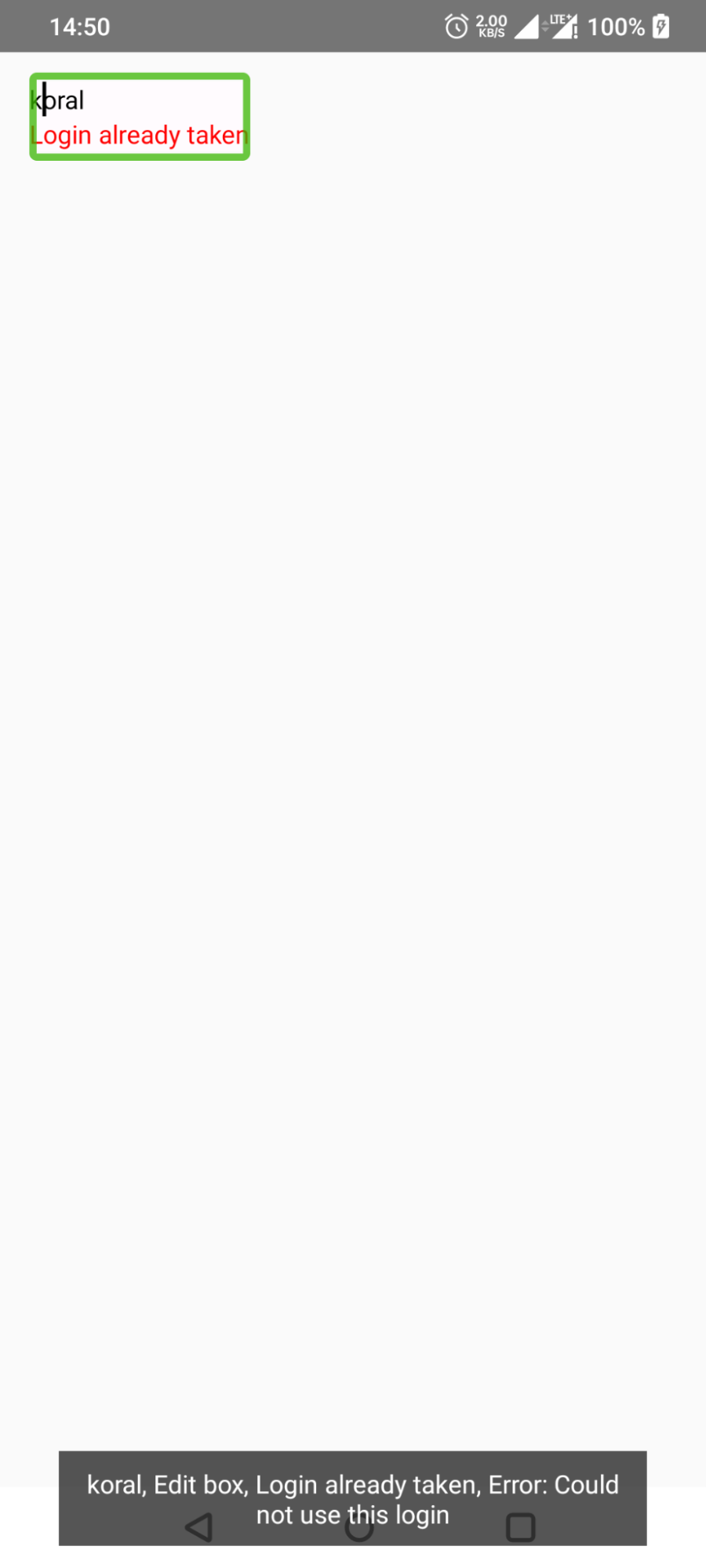
Note that the error semantics have some features of a live region described before. If the field becomes incorrect, then TalkBack will announce the error only once. It won’t keep reporting the error on the next changes if the field is still incorrect. Look at the following screencast:
It is a good idea to not report text field validation errors too often. It may be jarring for users, and not only for those using accessibility services like TalkBack. For example, the email is always incorrect at the very beginning of typing. It does not add much value to show a validation error if the user has only typed in the first few characters.
There are 2 possible improvements:
- Don’t report the error at the beginning, if the field is empty or only a small number of characters have been input.
- Debounce the input. Don’t validate and report the errors immediately when typing each character in a row. Wait a certain amount of time.
There is not a single universal debounce interval. Various guidelines typically recommend values from 300 to 500 milliseconds (0.3 to 0.5 seconds).
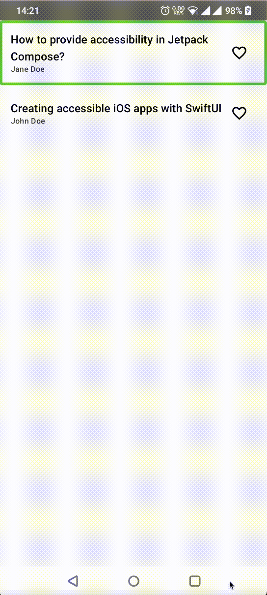
Preventing semantics overlap for better accessibility
Imagine that you have a screen showing a list of articles, like on the screencast below:
Its code may look like this:
Row(
    modifier = Modifier
        .clickable(onClick = ::onArticleClick)
) {
    Column {
        Text(text = "Creating accessible iOS apps with SwiftUI")
        Text(text = "John Doe")
    }
    IconButton(onClick = ::onAddToFavoritesClick) {
        Icon(
            imageVector = Icons.Outlined.FavoriteBorder,
            contentDescription = "Add to favorites"
        )
    }
}
For clarity, we ignore the custom click labels and the state of the “add to favorite” buttons. They are not a topic of this section. In the real app, if the item is already favorited, it should have the “remove from favorites” button.
The user can tap on each item to open an individual article screen. Each item also has “add to favorite” buttons. Despite the fact they overlap, both of them are accessibility focusable.
So far so good, but there is an issue there. Imagine that there are dozens or even hundreds of articles in the list. Moving a focus one by one through all of them may be cumbersome to TalkBack users.
So how can we improve the UX for people using accessibility services? The “add to favorite” action is much less frequent than opening an article. So we can make it a custom accessibility action. I already mentioned it in the previous part of this blogpost series.
With the custom action, we’re halfway to our destination. A button is still focusable. That’s because it has an on click callback set. We can’t remove it. The users operating on the touchscreen will lose the “add to favorite” functionality. They won’t be able to access the custom accessibility actions.
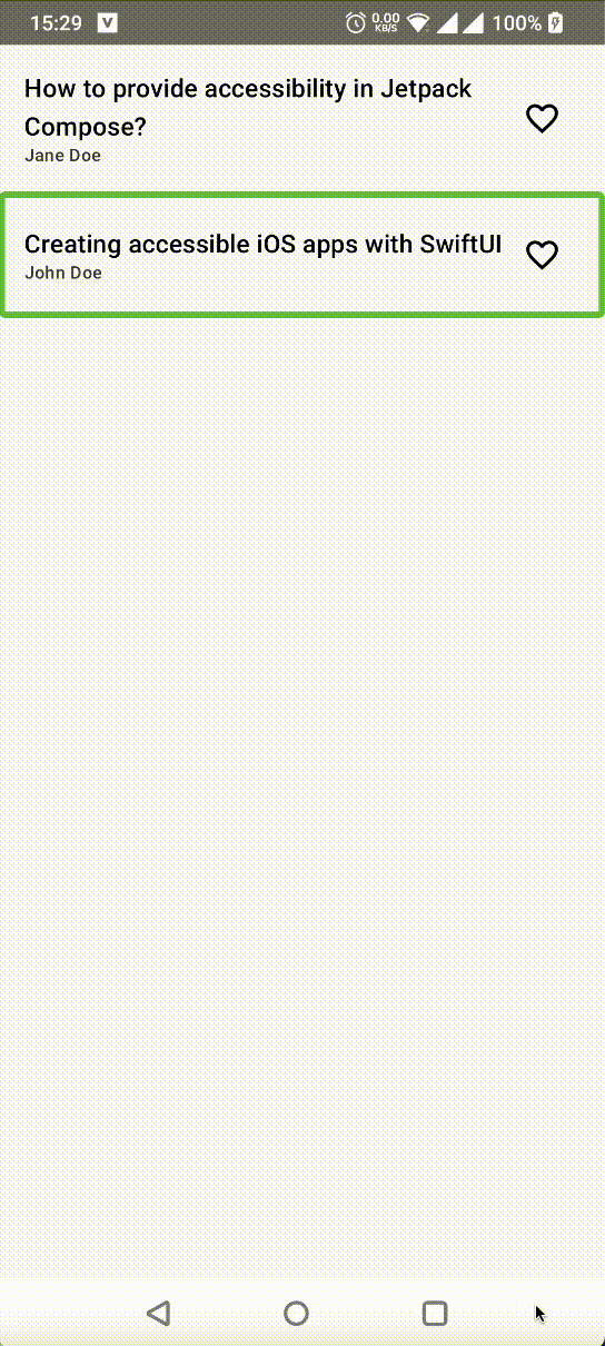
There is a way to only remove the button semantics without losing any functionality. You can use the clearAndSetSemantics function with an empty body. It works like semantics but replaces all the descendants’ semantic properties with the provided ones. The complete code should look like this:
Row(
    modifier = Modifier
        .semantics {
            customActions = listOf(
                CustomAccessibilityAction(
                    "Add to favorites",
                    ::onAddToFavoritesClick,
                )
            )
        }
        .clickable(onClick = ::onArticleClick)
) {
    Column {
        Text(text = "Creating accessible iOS apps with SwiftUI")
        Text(text = "John Doe")
    }
    IconButton(
        modifier = Modifier.clearAndSetSemantics { },
        onClick = ::onAddToFavoritesClick,
    ) {
        Icon(
            imageVector = Icons.Outlined.FavoriteBorder,
            contentDescription = "Add to favorites"
        )
    }
}
Now we can see that the “add to favorite button” is not accessibility focusable. However, its action is available to TalkBack:
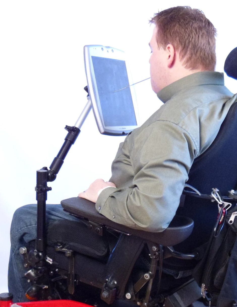
Screen orientation accessibility: Designing for all users
According to the WCAG guidelines, you should not restrict the screen orientation. Users may have their devices mounted in a fixed position like this tablet on the arm of a wheelchair:
To avoid locking the orientation, just don’t include any android:screenOrientation attributes in the manifest.
There are some exceptions which permit locking the orientation to a particular value. For instance, consider an app with a document scanning screen. In cases where the scanned papers are usually in landscape orientation, it makes sense to lock the screen orientation to landscape.
You should also avoid using plain values like portrait or landscape when it comes to the screenOrientation attribute. Use the userPortrait or userLandscape, respectively. Those values take the data from a device orientation sensor and user preferences. The resulting orientation may be upside down (reversed). See the official documentation for more information.
It’s easy to say “don’t lock the screen orientation” but what if the composable doesn’t look good, for example, in landscape mode? In such situations, you have to adjust the layout based on the available space.
Note that available space refers to neither the physical orientation, screen dimensions nor the device type. That’s important because your app may be in multi-window mode or inside a resizable window. They may have different dimensions than the physical screen. Take a look at the following image:
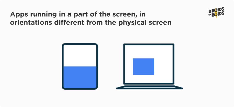
The actual app window orientation on the left is landscape. Yet the screen is in portrait mode. The Compose library provides several functions which can help you build adaptive layouts. Let’s examine them.
To get a current window size class, you may use the calculateWindowSizeClass() function. You can find it in the androidx.compose.material3:material3-window-size-class library. It returns an object containing the classes of both the width and height of the current window.
If you don’t have that dependency in your buildscript, you are using the Gradle version catalogs. If you choose the “Add library dependency and import” quick fix in IDE, you may have to adjust the aliases. The artifact id ends with “-class”. It is not a valid part of an alias name as the class identifier is reserved in Java.
There are three size classes: Compact, Medium and Expanded. The compact width represents the majority of phones in portrait mode. See the Window size classes documentation for more details. You can use the class to determine what to display – and how – in your composables. In most cases, it will be enough to take only the width into account.
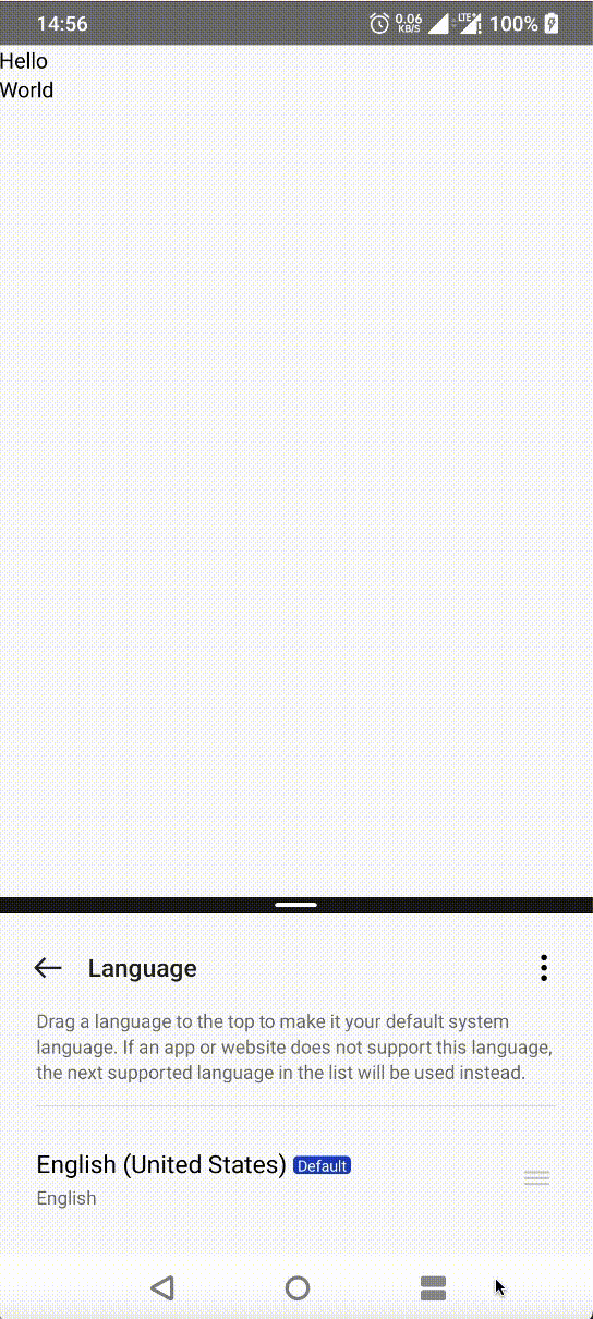
Another option is to use a BoxWithConstraints container. It has all the plain Box functionalities. However, it additionally provides the constraints of the parent like maxWidth. This enables you to change the arrangement of your composable according to the space that’s at hand. For example, you may build a row of the children on the large screens and a column on the small ones. Take a look at the snippet below:
BoxWithConstraints {
    val heightSizeClass =
        WindowSizeClass.calculateFromSize(DpSize(maxWidth, maxHeight)).heightSizeClass

    if (heightSizeClass < WindowHeightSizeClass.Medium) {
        Row {
            Text("Hello")
            Text("World")
        }
    } else {
        Column {
            Text("Hello")
            Text("World")
        }
    }
}
It should give results similar to this screencast:
Sometimes, you might need more precise control, such as when customizing a child composable’s exact position within its parent. In these situations, the Layout composable or layout modifier can be quite useful.
Building custom layouts in Jetpack Compose is quite an extensive topic. Describing them in more detail is out of the scope of this post about accessibility. Look at the official documentation for more details. You can also read this article about layout modifiers by Jorge Castillo if you are interested in that topic.
Mobile apps accessibility: Wrap-up
In this article, you learned about various semantic properties and how to support many screen orientations. Now you should be able to create TalkBack-friendly composables.
In the next part on accessible mobile apps, you’ll read about the mouse navigation, accessibility testing and more. Stay tuned, and let me know in the comments below if you have any questions!

