Table of contents
Data-driven companies are 23x more likely to acquire customers and 6x more likely to retain them, according to McKinsey research. With proper product analytics, you gain the capability to predict and prevent customer abandonment.
The numbers validate what successful product teams already know: product analytics isn’t optional anymore. In a recent Product-Led Alliance survey, 72.5% of product teams reported that analytics visibly helped them hit key goals, whether that’s revenue growth, user retention, or activation.
This guide walks you through product analytics fundamentals, from understanding quantitative and qualitative data to tracking the right metrics, building effective analytics systems, and avoiding common pitfalls. You’ll learn how to turn user behavior into actionable insights that drive measurable business outcomes.
Whether you’re launching your first analytics implementation or refining an existing system, these principles will help you make data-driven decisions that improve your product and grow your business.
What is product analytics?
Product analytics is the process of collecting, measuring, and analyzing data about how users interact with your product to make better product decisions.
Unlike traditional business intelligence that focuses broadly on company performance, product analytics zeroes in on in-product behavior, answering questions like:
- which features customers use most,
- where they struggle,
- how they derive value,
- where they abandon the experience entirely.
The discipline has evolved dramatically since the early days of web analytics. In 1993, measuring website traffic meant digging into server logs, with basic tools that could barely distinguish bots from humans.
Google Analytics arrived in 2005. As digital products became more sophisticated, the industry shifted from page-view-centric website analytics to event-centric product analytics, tracking users across multiple platforms and along increasingly complex user journeys.
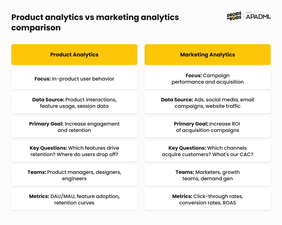
Product analytics vs marketing analytics
Marketing analytics helps you acquire customers, while product analytics helps you retain them. These disciplines serve different purposes, but they complement each other.
Marketing analytics is external, showing who your customers are and where they come from, while product analytics is internal, revealing how users actually interact with what you’ve built.
Why do you need product analytics?
Product analytics enables you to make data-driven decisions instead of relying on assumptions, guesswork, or intuition.
When it comes to digital products, users can abandon your app or platform with a single tap. To prevent it, you need visibility into real-time user behavior, revealing where users hesitate, which features they actually use, and the exact steps that lead to engagement or drop-off.
Knowing this enables you to make decisions that lead to higher customer satisfaction, loyalty, and retention.
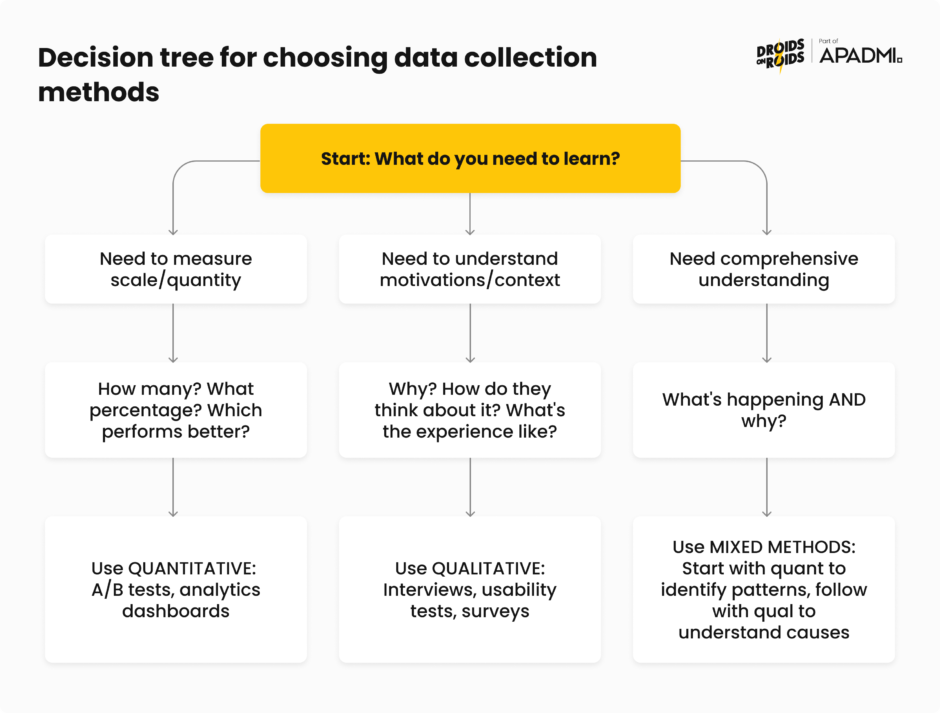
Understanding quantitative and qualitative data
Numbers (= quantitative data) tell you what happened. Stories (= qualitative data) tell you why. In product analytics, ideally you’d always make decisions based on both.
You might notice patterns in quantitative data, then layer in qualitative research to uncover why customers behave that way, giving you the full picture of a problem – and how to solve it.
A healthy mix of both types of data helps you avoid two traps:
- drowning in numbers without context,
- making decisions based on a handful of interviews that don’t represent the whole user base.
Measuring what happens with quantitative data
Quantitative analysis involves looking at hard data and actual numbers, answering questions about what, where, and when. It’s the foundation of product analytics, providing measurable evidence at scale.
In product analytics, quantitative data includes metrics you can count and measure:
- Engagement data – active users, session length, frequency of logins, or specific feature usage
- Behavior data – user actions such as clicks, mouse movements, tasks completed, or workflows
- Adoption and retention data – how quickly users adopt new features and the percentage of users who return over time
- Conversion and funnel data – steps taken toward goals, such as sign-ups or purchases
- Technical and performance data – bugs, error rates, load times, or crashes
- Contextual data – user location, device type (mobile, desktop), browser, or persona information
Collecting data is one thing, but you have to extract insights from it somehow. Broadly speaking, you do it with common quantitative methods, like:
- Descriptive statistics – calculating mean, median, mode, and standard deviation to understand central tendencies and spread in your data
- Inferential statistics – using hypothesis testing, t-tests, and regression analysis to make predictions about larger populations from sample data
- Data mining – discovering patterns using algorithms across large datasets
- Experimental design – running controlled experiments to determine causal relationships between changes and outcomes
In the context of product analytics, specialized methods include cohort analysis and funnel analysis. Cohort analysis includes grouping users based on shared traits to better understand their actions, whereas funnel analysis is used to analyze the sequence of events leading up to conversion.
Quantitative research becomes necessary when you already have a working product and you want to evaluate its usability and track it over time, or understand how users interact with specific features.
Understanding why it happens with qualitative data
Qualitative data is non-numerical information, like customer feedback or observations. While quantitative data answers “what” and “when,” qualitative research looks at words and meaning for the “why”.
In product work, qualitative data comes from sources like:
- open-ended survey questions,
- customer interviews,
- sales call feedback,
- support tickets,
- session replays.
Customer success calls and support tickets can show you unmet needs. Session replay tools auto-record user sessions, letting you watch them back to see bugs, errors, user behavior, and signs of frustration like rage clicks.
Key qualitative methods include:
- User interviews – gathering opinions about experiences, needs, and preferences through one-on-one conversations
- Usability testing – observing users interacting with your product to identify areas of improvement
- Diary studies – having users record their experiences over time to understand behavior in natural contexts
- Customer feedback analysis – systematically reviewing support tickets, NPS comments, and survey responses for themes
Qualitative research is critical during the discovery phase, when it can provide a detailed look into users’ thoughts and feelings. It identifies design and usability issues, and helps define possible solutions.
However, qualitative research is both formative (informing early design decisions) and summative (evaluating existing products), so it’s valuable at any point in the design cycle.
Combining both approaches with mixed methods research
The most effective product teams collect and analyze both types of data strategically. The weaknesses of each method are balanced by the strengths of the other, resulting in more useful insights.
Mixed-methods research combines qualitative and quantitative methods within a single research project to answer the same overarching question, intentionally integrating them before, during, and after data collection to provide a holistic view of the user experience.
This integration works through triangulation, which basically means using different methods to verify findings. When usage metrics match interview insights, you can be more confident in your conclusions. When they differ, you’ve probably discovered something interesting about how users think versus how they actually behave.
In practice, triangulation might look like this:
1. Start with quantitative data. Quantitative data is the best starting point because it shows the broad trends in user behavior. If you notice that a specific feature has low engagement, this signals that something may be wrong.
2. Dive deeper with qualitative research. Once you identify a trend, use qualitative methods like interviews or usability testing to understand why users are disengaging. These conversations help uncover the root cause, such as confusing navigation or unmet needs.
3. Validate findings. If interviews suggest a usability issue, check the data to see if usage patterns reflect that problem across your entire user base.
4. Iterate continuously. Combining both types of data is part of an ongoing process. As you gather more data, you refine your product continuously to address emerging issues or capitalize on new opportunities.
Essential metrics for retail and ecommerce mobile products
The essential KPIs are:
- Average Order Value (AOV)
- Sales Conversion Rate
- Store Traffic
- Customer Lifetime Value (CLV)
- Customer Retention Rate
They form the core measurement framework for most ecommerce businesses. But these “big five” are just the beginning. Understanding which metrics to track and prioritize separates successful product teams from those drowning in dashboards.
With data privacy regulations like GDPR and CCPA limiting third-party data collection, eCommerce businesses should prioritize KPIs derived from first-party data. Metrics such as customer lifetime value, repeat purchase rates, and email engagement have gained importance.
Ecommerce conversion metrics are arguably the most important indicators of your online store’s performance because they measure actual sales and buyer behavior.
Let’s break down the most important metrics by category, with formulas, benchmarks, and what they actually tell you about your product.
Understanding user activity with engagement metrics
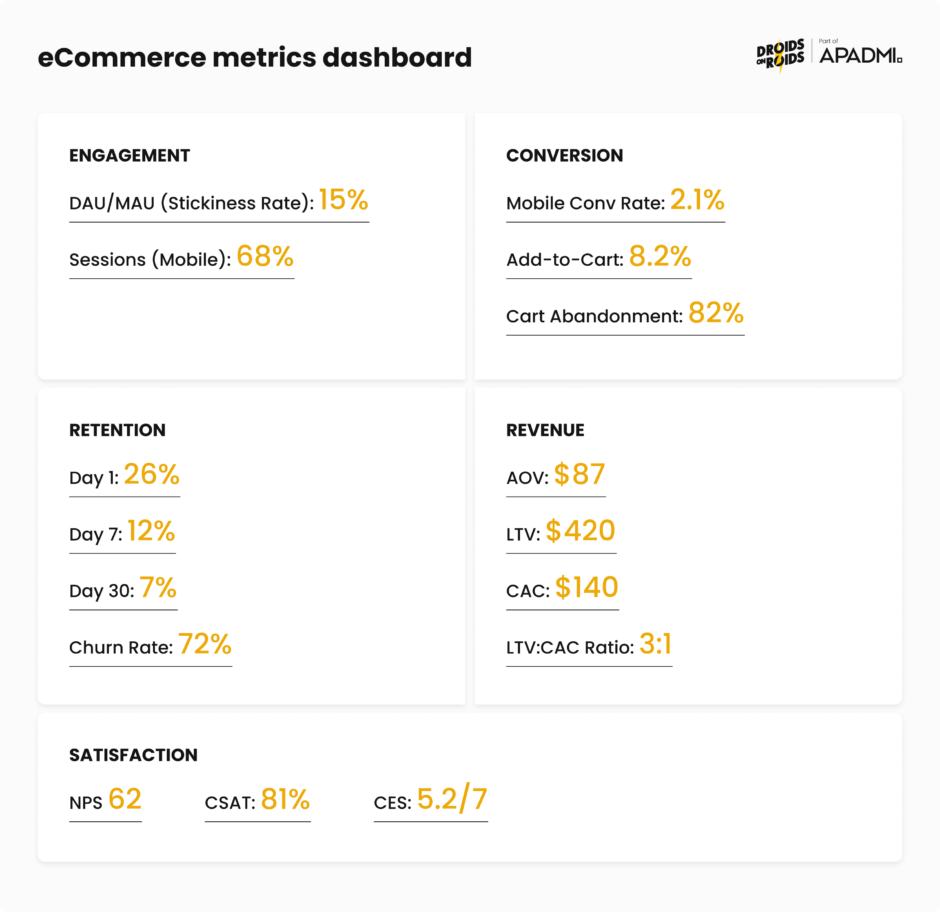
DAU/MAU (Daily Active Users / Monthly Active Users): the DAU/MAU ratio, often called the “stickiness ratio,” measures what percentage of your monthly users return daily. It’s calculated simply:
(DAU / MAU) × 100
For eCommerce apps, expectations must align with natural shopping behavior. Products in the eCommerce category show an average stickiness of 9.8%.
This is much lower than social apps (50-80%) or productivity tools (40-60%), but that’s to be expected. People don’t shop nearly as often as they scroll TikTok. Don’t chase unrealistic benchmarks from different product categories.
Sessions by device type: measure visitors to your site by what device they are using (mobile, desktop, other). If most visitors come from mobile devices, you need mobile-optimized experiences, faster load times, and thumb-friendly navigation.
If you have a lot of people accessing your website via mobile, building a mobile app can increase your sales and retention. The data tells you where to invest development resources.
From browsing to buying with conversion metrics
Conversion rate: your conversion rate measures the percentage of visitors who complete a desired action, like a purchase or a sign-up. The formula is different depending on the funnel stage. For purchase conversion, it’s:
(Total Purchases / Total Visitors) × 100
Mobile conversion is challenging. As of October 2024, the average mobile conversion rate across online stores was 2.85%.
Add-to-cart rate: this measures what percentage of visitors add items to their cart. The formula is:
(Add to Cart Events / Sessions) × 100
The average add-to-cart rate on mobile is 7.5%. Users browse and add items, but change their mind before checking out.
Install-to-purchase rate: for retail apps, the average install-to-purchase rate is 1.38%, measuring how many app installs eventually result in purchases. This metric tells you about the effectiveness of your entire onboarding and first-purchase experience.
Keeping users coming back with retention metrics
1-day, 7-day, and 30-day retention: retention rate measures the percentage of users who return to your app after their initial visit. It’s calculated:
(Users who returned on Day X / Users who installed on Day 0) × 100
The benchmarks for shopping apps reveal that the average 1-, 7-, and 30-day retention rates are, respectively, 29.09%, 18.26%, and 7.2%.
Churn rate: measures the percentage of customers who stop paying for or using your product within a particular time frame. For mobile apps specifically, it refers to users who uninstall the app or stop using it after downloading. The formula is:
((Total Users on Day X – New Users on Day X) / Total Users on Day 0) × 100%
The statistics are pretty bad. For apps of all categories, most users churn on Day 1 after completing just one session. By Day 30, over 95% of users on both Android and iOS have churned.
This makes the first session and the following week critical for establishing value and habit formation.
Measuring financial performance with revenue metrics
Average Order Value (AOV): AOV measures the average revenue generated per transaction. Calculate it by dividing total revenue by the number of orders over a specific period.
AOV = Total Revenue / Number of Orders
Rising AOV often signals successful cross-selling and upselling strategies, improved product bundling, or better customer targeting. It directly impacts lifetime value calculations and can improve profit margins without increasing acquisition costs.
Customer Lifetime Value (LTV): lifetime value is the total revenue a business expects from a customer over the entire period of their relationship. This helps you understand how much you can afford to spend acquiring customers.
LTV = (Average Order Value × Purchase Frequency) × Customer Lifespan
LTV is the cornerstone of sustainable growth. It tells you the maximum you should spend on acquisition while remaining profitable.
Customer Acquisition Cost (CAC): CAC quantifies the total cost of acquiring a new customer, including all marketing and sales expenses over a specific period.
CAC = Total Marketing and Sales Expenses / Number of New Customers Acquired
The relationship between metrics matters: CAC < AOV and CAC < LTV is relevant for all types of businesses. To stay profitable, the revenue brought in by your customers should exceed the cost you spend to attract them.
LTV:CAC ratio: a ratio of 3:1 is great, meaning every $1 spent on acquisition should generate $3 in customer revenue.
This ratio ensures sustainable and profitable scaling. Too low means you’re overspending on acquisition. Too high might mean you’re underinvesting in growth opportunities.
Return on Ad Spend (ROAS): ROAS measures the revenue generated for every dollar spent on advertising. It helps you understand the profitability of marketing campaigns.
ROAS = Revenue Attributed to Ads / Total Advertising Costs
However, ROAS measures short-term campaign performance but doesn’t account for customer acquisition costs or long-term value. Use it alongside LTV and CAC for a complete picture.
Feature adoption rate: this tells you how many users have successfully incorporated a specific feature into their workflows. Low adoption of key features despite onboarding efforts often signals a disconnect with user needs.
Measuring experience quality with customer satisfaction metrics
Net Promoter Score (NPS): NPS is a long-term metric that measures how likely a customer is to recommend your product or service to others. Collecting the data is simple. Just ask customers, ‘how likely are you to recommend this app on a scale of 1-10?’
The score itself, calculated once you have enough answers to make it statistically meaningful, is expressed on a scale of -100 to 100. It’s calculated by subtracting the percentage of detractors (scores 0-6) from promoters (scores 9-10).
The average eCommerce NPS benchmark sits at 45.
Customer Satisfaction Score (CSAT): CSAT measures how satisfied customers are with a specific interaction, product, or service. Typically using a 1-5 or 1-10 rating scale, it’s calculated as:
(Number of Positive Responses / Total Responses) × 100
In ecommerce, the benchmark hovers around 80%. A CSAT of 75% or higher is generally considered strong, and 85%+ is excellent.
Customer Effort Score (CES): CES measures how easy or difficult it is for customers to get their issue resolved, complete a task, or interact with your business. Usually a 1-7 or 1-5 scale, where higher numbers indicate less effort required.
CES (average score) = Sum of All Responses / Number of Responses
CES focuses on whether it requires high or low effort for a customer to accomplish a task. The less effort required, the more likely customers stay loyal.
How product analytics systems work and basic data architecture
Behind every useful insight about user behavior there’s a sophisticated data infrastructure.
The landscape has shifted in recent years, with event-based architecture becoming the de facto standard, with almost all digital analytics vendors using this data architecture.
Event-driven architecture
Modern product analytics platforms like Amplitude, Mixpanel, Pendo and AppsFlyer are built on an event-driven model. Event-based data models focus on collecting events and properties to track customer interactions.
You can source these events and properties from any interaction: a web page, mobile app swipe, call center, physical store transaction, and so on.
Unlike older page-view-based models that could only tell you someone visited a page, event-based systems capture specific actions: button clicks, form submissions, video plays, purchases, anything that happens in your product.
An event has three components:
- Event name – what happened (“Checkout_Started”, “Video_Played”)
- Properties – contextual details about the event (product_id, video_duration, payment_method)
- User identity – who performed the action (user_id, anonymous_id)
This structure enables the segmentation and funnel analysis that makes modern product analytics valuable.
From user action to database with data collection
Data collection in mobile apps starts with an SDK (Software Development Kit) integration. These SDKs are designed to capture various user interactions within the app, from basic usage statistics to more complex events like in-app purchases. For websites, JavaScript snippets embedded in web pages track various user actions like page views, clicks, and form submissions.
At a high level, your analytics pipeline looks like this:
- Instrument events on web/mobile/server
- Ingest into analytics platform
- Store in optimized database
- Query for analysis
Event tracking and instrumentation best practices
Implementing event tracking correctly from the start saves you from having to clean it up later.
Try to keep your schema simple and consistent. Event taxonomies that sprawl make analysis slow and brittle, so keep your schema short and versioned. Enforce a consistent naming convention using a standard Object_Action format (“Playlist_Created”, “Checkout_Completed”, “Video_Paused”).
This naming convention makes your analytics self-documenting and enables anyone on your team to understand what events represent without consulting documentation.
Start small with about a dozen core events, one funnel, one cohort, and a single change aimed at the biggest drop. In a week, you’ll have a clear starting point and proof that the practice works. Resist the temptation to track everything, as you’ll drown in data without gaining insights.
If possible, reuse existing events. Look at existing data documentation, and ask fellow data analysts and engineers if an existing event fits your tracking needs. If an event already exists for page loads, see if you can use it as-is, or at most add properties to it, but avoid adding a new one. Event proliferation is a common problem that makes analytics harder, not easier.
Sending events from the backend is more reliable because the backend runs trusted code in a trusted environment. The frontend can be tampered with, simulated by bots, and lose connection. Sending events from the backend also saves time: events need to be implemented only once for all clients hitting that API.
Why clean data matters
The International Institute of Business Analysis (IIBA) emphasizes that quality beats quantity: “A smaller, cleaner dataset almost always reveals more than a giant swamp of messy data”. They refer to clean data as “the real superpower” in business analytics.
High-quality data increases the accuracy of analytics, including those that rely on AI, which can lead to better business decisions, improved internal processes, competitive advantages, and higher sales.
IIBA identifies “ensuring accurate, quality, accessible data” as one of six important practices essential for organizations that wish to become data-driven. Clean code is only one part of it. It also requires taxonomy consistency, event naming conventions, property standardization, and documentation that makes your data understandable long after implementation.
Powering product growth with funnel analysis and retention
Acquisition without retention is unsustainable and expensive. Understanding where users drop off (funnel analysis) and whether they come back (retention analysis) are two of the most effective ways to diagnose product health.
Mapping the path to conversion with funnel analysis
Funnel analysis involves mapping and analyzing a series of events that lead towards a defined goal, like an ad-to-purchase journey, or the flow that starts with user engagement in a mobile app and ends in a sale. A funnel is a sequential series of steps that visualize a user flow to conversion, whether that’s a signup, a purchase, or completing a level in a game.
Funnel analysis is powerful because it’s focused. It enables you to understand how your conversion rate varies by any user attribute or behavior, so you can figure out which users are more likely to convert, what causes drop-off, and what dropped-off users do instead.
Product analytics platforms typically offer three complementary views of funnel performance:
- Conversion steps – shows where users are dropping off in your funnel and the number of people converting between steps
- Time to convert – reveals steps with the highest friction, where steps with a long time to convert are likely much harder than steps with a short time
- Historical trends – shows how your conversion rate has changed over time for users who entered the funnel on a given date, useful for understanding how changes, fixes, and new features have affected success rates
Overall conversion rate (whole funnel) helps you understand the entire funnel, whereas relative conversion (between different stages of the funnel) shows you which steps have the biggest opportunity for improvement.
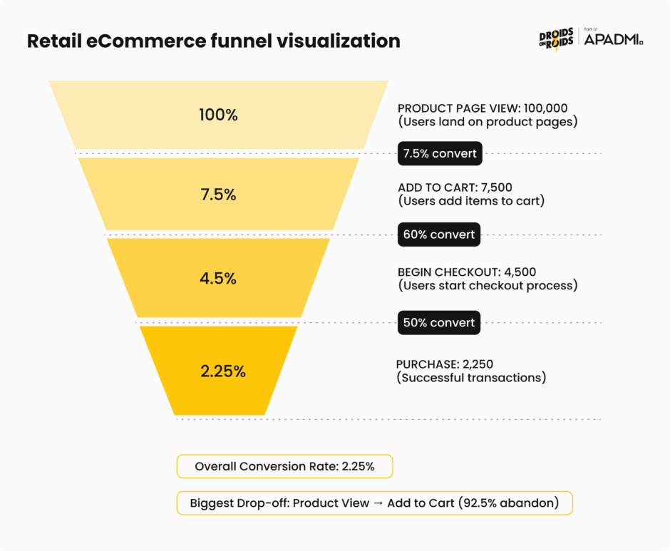
The retail ecommerce funnel
For retail and ecommerce products, the typical funnel includes four key events: view_item, add_to_cart, begin_checkout, and purchase, which correspond to the main conversion points in the customer journey.
Funnel conversion rates are calculated as:
- Visit to View Rate = (Product Views / Total Visits) × 100
- Views to Cart Addition Rate = (Add to Carts / Total Product Views) × 100
- Cart to Checkout Rate = (Checkout Initiations / Add to Carts) × 100
One advantage of using a conversion funnel is measuring performance stage by stage. For example, a store might get high traffic but low add-to-cart rates, while another may have a healthy add-to-cart rate but low checkout completion. Each pattern points to different problems requiring different solutions.
Consider this example: out of 87,296 users who viewed products, only 6,136 (7.03%) added them to their cart, suggesting potential issues with product pages such as poor images, unclear descriptions, or high prices. Without funnel analysis, you might increase traffic when the real problem lies in the product page experience.
How do you go about optimizing your funnel? It’s best to use a systematic approach:
- Identify the bottlenecks – analyze conversion rates at each stage to pinpoint areas with significant user drop-offs
- Understand why users leave – use surveys, heatmaps, and session recordings to understand why users abandon the funnel at specific points
- Focus on high-impact areas – address the drop-off points that have the biggest impact on your overall conversion rate
Tracking users over time with cohort retention analysis
While funnels show you the path users take, cohort analysis shows you whether they come back. Cohort analysis is a method for tracking a group of users over time. More specifically, it’s a method of data-driven reporting that seeks to understand user behavior by grouping audiences around shared traits.
There are several types of cohort analysis used in product analytics:
- Acquisition cohorts – divides users into cohorts based on acquisition events, such as signing up for the product or subscribing to a paid version
- Behavioral cohorts – groups divided based on their behaviors and actions in your product, allowing you to view active users in different demographics and with different behavioral patterns
- Predictive cohorts – uses historical patterns to forecast future behavior and retention likelihood
How do you build a retention cohort? The process involves counting how many users entered the product to determine cohort size, then for each following day, counting how many from that same cohort returned. This creates a retention table showing how different cohorts behave over time.
Key metrics in cohort analysis include:
- Retention rate – the percentage of cohort users that stick with a product or service over time
- Churn rate – the percentage of users who stop using a product or service within a given time frame
- Customer lifetime value – estimates the total revenue a customer generates throughout their relationship with your business
When it comes to mobile apps, retention is more important than downloads, It doesn’t matter how many installs you have if most users are abandoning the app on Day 1, never to return. Retention directly impacts user engagement, monetization, and long-term success.
This makes retention a direct revenue driver. Every percentage point improvement in retention compounds over time, boosting your unit economics and competitive position.
Identifying and fixing drop-off points
Both funnel and cohort analysis point you toward drop-offs, but you need additional analysis to understand why they happen:
- Segment by user attributes – compare conversion and retention rates across user segments (new vs. returning, mobile vs. desktop, different acquisition channels). Aggregate numbers might hide the fact that one segment performs well while another struggles.
- Analyze user paths – what do users who drop off do differently from those who convert? Which features do they interact with? How much time do they spend before abandoning?
- Combine qualitative insights – session recordings, user interviews, and support tickets provide context that numbers alone cannot. Watch actual users struggle at the point where your funnel shows the biggest drop.
- Test systematically – once you identify potential friction points, A/B test solutions. Did simplifying the checkout reduce abandonment? Did adding social proof increase add-to-cart rates?
The combination of quantitative funnel/cohort analysis with qualitative research creates a complete picture of user behavior, so you can prioritize improvements that actually move the needle.
Testing and experimentation
Analytics tells you what’s happening and where users struggle. Experimentation tells you whether your proposed solutions actually work.
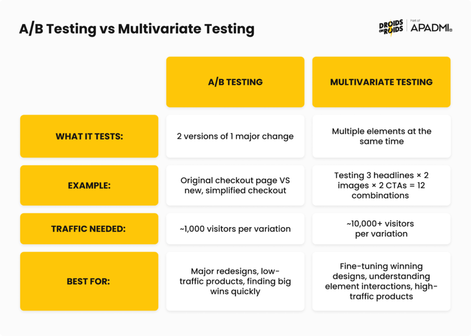
One way to experiment is through A/B testing, a data-driven methodto optimize product or landing page performance through statistical hypothesis testing, comparing variations against a control group to determine which performs better. Without A/B testing, you’re essentially flying blind, making changes based on limited data.
You can also do multivariate testing. A/B testing compares two versions of a single variable against each other to determine which one performs better – multivariate testing involves multiple versions of multiple variables. The main advantage of running a multivariate test is the ability to determine how various elements on a page interact with one another, discovering the best combination of elements overall.
Real-world examples of turning analytics into action
In a 2024 Product-Led Alliance survey, 32.3% of respondents cited revenue growth as their primary goal with product analytics, followed by user retention (29.8%) and activation (23.4%), with more than two-thirds saying analytics visibly helped them achieve these outcomes.
But how do companies actually achieve this goals? Let’s look at a few examples.
PlaceMakers, a construction material supplier in New Zealand, experienced rapid growth after launching its app with over 3,000 daily users and 100,000 monthly sessions. They faced challenges keeping stock levels updated, causing frustration at checkout.
When they introduced a “Constrained Products” tag to indicate low-stock items, sales dropped by 80%. Session replays and heatmaps revealed the messaging was too intrusive and scared users away from purchasing.
The team identified less intrusive messaging that still communicated stock status without triggering abandonment. The result was a 2X increase in sales. A 200% improvement simply by understanding how users interpreted their messaging.
This is what you can achieve by combining quantitative metrics (sales drop) with qualitative tools (session replays) to understand not just what happened, but why.
Costa Coffee was trying to launch a loyalty program through its mobile app but faced a problem: 30% of users were dropping out during registration.
Product analytics revealed specific friction points in the signup flow where users abandoned the process. The form was too long, required unnecessary information, and didn’t clearly communicate the value of completing registration.
So, Costa simplified the registration flow, reduced required fields, and added progress indicators showing users how close they were to completion. This resulted in vastly improved registration completion rates.
Inspire Fitness leveraged features like session recording, event analytics, issue analytics, and heatmaps to craft a strategy centered around user needs.
Data revealed that users were struggling to discover key workout features, and technical issues were causing frustration at critical moments in the user journey.
Based on analytics, they improved feature discoverability, fixed technical issues causing drop-offs, and optimized the onboarding experience to highlight value faster. The results was a 460% increase in app usage time and a 181% boost in new user sign-ups.
Walmart achieved an overall conversion boost of 20% on all devices, with mobile orders increasing by 98%. They used hands-on usability testing on both old and new designs, A/B tested various elements, and made overall speed improvements.
Mobile traffic was growing, but mobile conversion lagged desktop significantly. User behavior data showed that the existing design wasn’t optimized for mobile interactions.
They solved it with a complete responsive redesign based on mobile user behavior patterns, combined with performance optimization to reduce load times. This resulted in nearly doubled mobile orders, while improving desktop conversion by 20%.
Connecting insights to business outcomes
The gap between “interesting insight” and “business impact” is where many analytics initiatives fail. To bridge this gap:
1. Start with business objectives – don’t just analyze what you can measure. Define what business outcome you’re trying to move (revenue, retention, NPS), then work backward to identify the user behaviors that drive it.
2. Build causal models – correlation isn’t causation, but you can use techniques like cohort comparison and A/B testing to establish causality. Users who engage with feature X retain 2x better, but does the feature cause retention, or do engaged users simply use more features?
3. Quantify the opportunity – how much revenue is at stake? If you improve this metric by 10%, what’s the dollar impact? This sizing helps prioritize and secures executive support.
4. Create feedback loops – implement the change, measure the impact, learn from the results, and feed insights back into your next prioritization cycle. Analytics is a continuous process, not a one-time project.
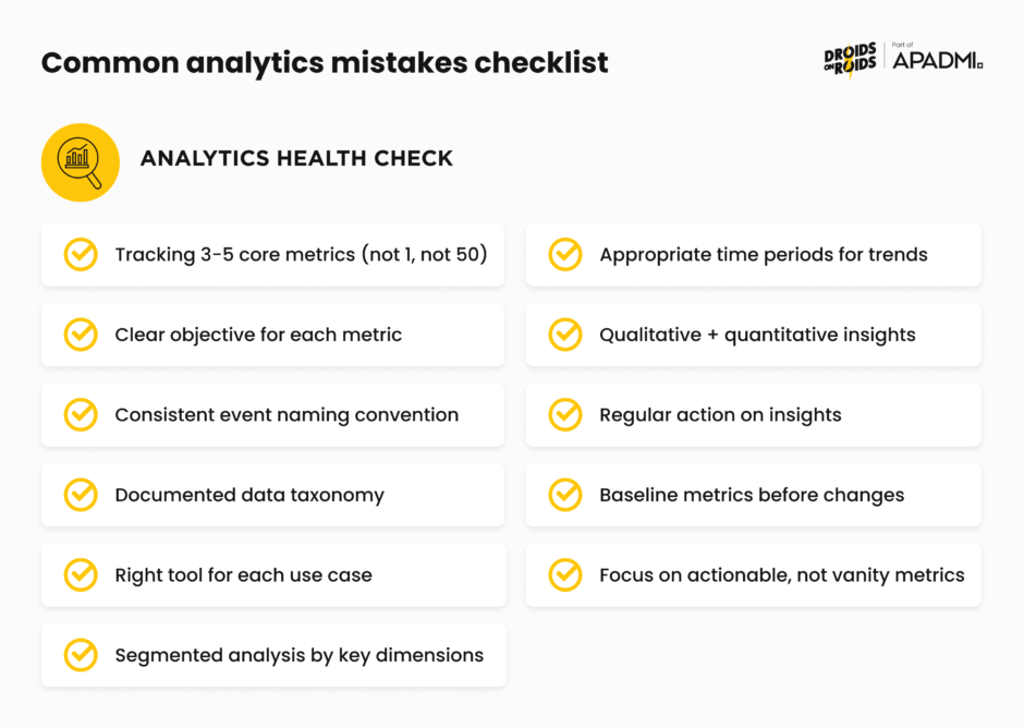
Beginner product analytics mistakes to avoid
Even small mistakes can lead to messy setbacks and incorrect conclusions. Here are the most critical errors and how to avoid them.
1. Tracking too many metrics (or too few)
One of the most common mistakes is choosing the amount of metrics to track. It can be tempting to pick as many as you can, or pick one and hope for the best.
When you’re starting out, try picking up to 5 metrics. Start with a focused set of North Star metrics aligned to business objectives, then add secondary metrics that help you understand the “why” behind changes.
2. Lack of clear objectives
Defining clear objectives is like setting a destination for your journey. Without it, you risk collecting irrelevant data and drawing inaccurate conclusions. Digging into data without knowing why is a common error. You’re supposed to use the data to answer specific questions you have.
Before implementing any analytics, think about what decision will this data help you make. If you can’t answer that, don’t track it yet.
3. Poor event taxonomy and naming chaos
Maintaining a clean and consistent taxonomy is a challenge. Messy or shallow event taxonomies guarantee funnel blind spots, wasted acquisition spend, and hit-or-miss A/B tests.
If event names are unclear and no one in your organization knows what your event data means, your team can’t build confidence in their ability to answer questions about user behavior.
New users often add too many custom events without rules, with names varying like “btn_click” versus “button_press,” causing data to split and lose power. Multiple events may appear to be duplicates with different names, and they could all actually be the same event.
If initial taxonomy fills up with UI elements, it might be time to regroup, as teams may track too many granular elements instead of focusing on user flow goals.
The solution is to establish clear naming conventions early (Object_Action format), document your taxonomy, and review it regularly with your team.
4. Using the wrong analytics tools
When starting to track analytics, you don’t want to be using marketing analytics for product analytics purposes. Marketing analytics tools are optimized for attribution and campaign performance, not for understanding in-product user behavior.
Choose tools designed for your specific use case: product analytics platforms for feature usage, marketing analytics for campaign performance, business intelligence for executive reporting.
5. Poor data segmentation
Aggregate data gives you the big picture but can obscure critical patterns. By lumping all users together, product managers risk overlooking behaviors unique to specific groups. A 5% conversion rate might look decent until you realize it’s 15% for one segment and 1% for another.
Segment your analysis by key dimensions: user type, acquisition channel, device type, geography, and behavioral cohorts. The insights hiding in segments are often more valuable than top-line numbers.
6. Analyzing with the wrong time periods
If you’re looking at your data at too short a time period, you’ll end up changing decisions all the time. If you’re using too large a time period, you’ll always be behind with your analysis.
Match your time period to the natural cycle of your business. B2B SaaS might need monthly views, while consumer apps might need daily granularity. Account for seasonality, day-of-week effects, and business cycles.
7. Confusing correlation with causation
Remember, correlation does not imply causation. This is a classic pitfall in analytics. Just because two variables move together doesn’t mean one causes the other. Users who watch onboarding videos might have higher retention, but do videos cause retention, or do naturally engaged users just watch more videos?
Use controlled experiments (A/B tests) and cohort comparisons to establish causality. Be skeptical of correlations and test them rigorously before drawing conclusions.
8. Ignoring qualitative insights
Collecting lots of data may seem like a sure-fire way of ensuring you have actionable insights, but quantitative data can’t tell you everything. Qualitative data can provide detail that numbers can’t. Numbers show what users do, conversations and observations show why they do it.
Combine quantitative signals (this funnel has 60% drop-off) with qualitative research (users say the form is confusing) for complete understanding.
9. Analysis paralysis
One of the biggest mistakes is organizational. Teams collect mountains of data, create beautiful dashboards, and have endless discussions, but never actually implement improvements based on the insights.
Analytics is worthless without action. Set deadlines for decisions, run experiments, ship improvements, measure impact, and iterate. Imperfect action usually beats perfect analysis.
10. Not establishing baselines before making changes
You can’t know if your change worked if you don’t know where you started. Teams launch new features or redesigns without properly measuring the before state, making it impossible to quantify impact.
Before any significant change, document baseline metrics for at least 2-4 weeks. This gives you a stable comparison point and accounts for natural variability.
11. Focusing on vanity metrics
Vanity metrics like page views may look impressive but do not inform progress toward goals. They make you feel good without helping you make better decisions.
Focus on metrics that predict business outcomes: retention over downloads, revenue per user over total revenue, engaged users over registered users.
Ready to get started with product analytics?
Product analytics is a journey that lasts as long as the product exists. The tools will evolve, your product will change, and you’ll discover new questions to answer. What matters is building the foundational capabilities, like clean data, clear questions, systematic analysis, and bias toward action. This will enable you to continuously improve your product based on evidence rather than opinion.
Your users are telling you what they need through their behavior. Product analytics gives you the ears to listen and the language to understand. Now go build something they’ll love.